This scenario is based on real data, but has been adapted slightly to serve as an illustration of the use of control charts in monitoring a clinical trial.
Suppose a clinical trial was set up in 1997 and the goal was to recruit one patient per month over a ten year period, for a total sample size of 120 patients. Here are the dates of recruitment for the first 42 patients.
 "2/26/1997"   "4/4/1997"   "7/7/1997"  "7/25/1997"   "2/5/1998"
 "2/15/1998"   "3/6/1998"   "7/3/1998"   "8/3/1998"   "2/8/1999"
 "3/19/1999"  "4/20/1999"  "5/29/1999"  "6/21/1999"  "7/27/1999"
  "9/6/1999"  "1/10/2000"  "1/11/2000"  "2/28/2000"   "3/3/2000"
 "4/13/2000"  "5/30/2000" "11/21/2000" "12/18/2000"   "2/6/2001"
 "4/30/2001"   "8/3/2001" "11/20/2001"  "12/3/2001"  "12/7/2001"
 "9/27/2002"  "10/1/2002"   "2/2/2003"   "3/3/2003" "10/31/2003"
 "11/4/2003" "11/11/2003"   "1/5/2004"   "2/2/2004"  "4/15/2004"
 "5/23/2004"   "6/2/2004"
If you set 1/1/1997 as Day 0, then the days on which patients were recruited to the study are
  56   93  187  205  400  410  429  548  579  768  807  839
 878  901  937  978 1104 1105 1153 1157 1198 1245 1420 1447
1497 1580 1675 1784 1797 1801 2095 2099 2223 2252 2494 2498
2505 2560 2588 2661 2699 2709
Distinguishing between monthly, quarterly, and yearly rates
You might ask some questions about this data, like
- Is the accrual rate close to the original goal?
- Has there been any recent changes in the accrual rate?
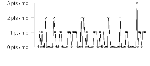
A simple approach to help answer these questions is to compute the number of patients recruited each month.
  1  2  3  4  5  6  7  8  9 10 11 12 13 14 15 16
  0  1  0  1  0  0  2  0  0  0  0  0  0  2  1  0

 17 18 19 20 21 22 23 24 25 26 27 28 29 30 31 32
  0  0  1  1  0  0  0  0  0 1   1  1  0  1  1  1

 33 34 35 36 37 38 39 40 41 42 43 44 45 46 47 48
  1  1  0  0  0  2  0  2  0  1  0  0  0  0  0  1

 49 50 51 52 53 54 55 56 57 58 59 60 61 62 63 64
  1  1  0  0  1  0  0  1  0  0  0  2  1  0  0  0

 65 66 67 68 69 70 71 72 73 74 75 76 77 78 79 80
  0  0  0  0  0  2  0  0  0  0  1  1  0  0  0  0

 81 82 83 84 85 86 87 88 89 90 91
  1  1  1  0  0  0  3  0  1  1  0
Here is a plot of the data:
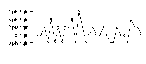
The accrual could also be summarized as the number of patients recruited per quarter.
  1  2  3  4  5  6  7  8  9 10 11 12
  1  1  2  0  3  0  2  0  2  2  3  0

 13 14 15 16 17 18 19 20 21 22 23 24
  4  2  0  1  2  1  1  2  1  0  0  2
which looks like this when you plot the data
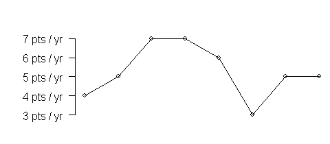
or as a yearly rate
1 2 3 4 5 6 7 8
4 5 7 7 6 3 5 5
which looks like this when you plot it.
It is not clear what scale is most logical for this data. Should you analyze the data monthly? That allows you to respond quickly if a trend appears, but such a short time span leads to a lot of imprecision in any individual monthly value. A yearly trend provides a more stable estimate, but does not allow you to respond quickly to sudden shifts. Quarterly data offers the best (worst?) of both worlds.
Applying control charts to rates
The trouble with rates becomes more apparent when you try to apply control chart limits to the data. Here is a simple control chart for the monthly rates.
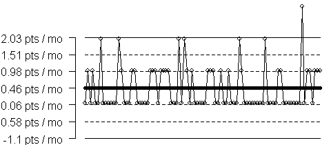
Note that the minus signs got clipped off the values of -0.06 and -0.58. Sorry!)
The center line for the plot is 0.46, which shows that the average rate is well below the target. But the control limits are -1.10 and 2.03, which are unrealistic on both ends of the scale.
There are many different algorithms for deciding whether a signal has occurred in a control chart. A commonly used standard involves dividing the control chart into zones. Zone A is 2-3 sigma away from the mean and is represented in the chart above as the region between the thin solid line and the dotted line. There are actually two A Zones, one above the center line and one below. Zone B is 1-2 sigma away from the mean and is represented by the region between the two dotted lines. Again there are two zones, above and below the centerline. Zone C is 0-1 sigma away and is represented by the region between the thick solid line and the dotted line.
A commonly used set of rules, called the Western Electric Company (WECO) rules declare that a signal occurs (also known as an out of control condition, or a special cause) if
- a single point falls outside of all the Zones
- two out of three points fall in Zone A or beyond and on the same side of the centerline
- four out of five points fall in Zone B or beyond and on the same side of the centerline
- eight consecutive points fall in Zone C or beyond and on the same side of the centerline.
These rules are documented at the NIST Statistics Engineering handbook in section 6.3.2
These rules appear to work well in a wide range of applications and have a good balance between false positives (declaring the process out of control when everything was actually running consistently) and false negatives (failing to declare the process out of control when a special cause of variation has indeed occurred). There are variations of these rules (some people, for example, will ask for nine consecutive points in Zone C) and additional rules that others will add (such as seven consecutive increasing or decreasing points).
A negative value for the lower control limit means that it is impossible for a single month to produce a rate that is so low that you would identify it as a special cause. Since Zone A is entirely in the negative range, you can’t use the two out of three rules either. For this chart, even Zone B is entirely in the negative range. So the only rule that works when the rate slows down is eight consecutive points below the centerline. So for this chart that means eight consecutive months without recruiting any patients at all! In a study which only seems to accrue a half a patient per month, perhaps this is not such an outrageous time frame.
In a typical research study, no one is usually too interested in discovering whether the accrual rate has taken a sharp upturn, so perhaps the upper control limit is not all that important. Still, it is worth pointing out that the upper control limit of 2.03 is also a bit unrealistic. I suspect that recruiting 3 patients in a month hardly seems like an indication that the process of accrual has suddenly accelerated. I want to formally investigate this to verify my hunch. My suspicion is that when the data are seriously skewed, the control limits also need to be skwed.
The control chart for the quarterly data exhibits much the same issues as the monthly data.
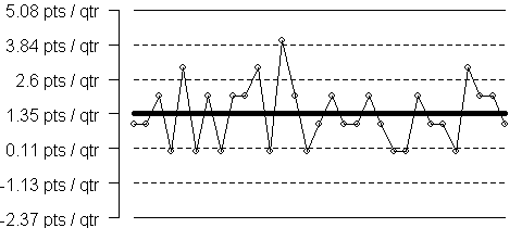
The control limits are -2.37 and 5.08. The value of zero falling into Zone B (between the one and two sigma limits) is fortunate, because otherwise you have to wait eight consecutive quarters before you could declare a slowing in the accrual rate. Applying the third of the four WECO rules, you could declare a change in the accrual process if four out of five consecutive quarters show no new patients. This means that a signal could occur in as little as four quarters (one year).
The control chart for yearly data is a bit better, perhaps.
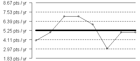
The control limits are 1.83 and 8.67. The problem with the yearly chart is not the control limits but rather the delay in discovering a trend. If you apply one classic rule for declaring a point out of control (4 out of 5 data points outside the 1 SIGMA limits), you would have to wait 4-5 years before you would accumulate evidence that the accrual process has changed. You could get a quick reaction if you observe a single year with one or fewer patients being recruited.
Which of these control charts is best? You may have to apply the Goldilocks rule to the time interval (not too short and not too long). Donald Wheeler has some rules for control charts that are too “granular” (meaning the chart only hops around a very small number of values). The monthly rate chart is too granular, by Wheeler’s rules, I suspect, but I have to double check this.
- Advanced Topics in Statistical Process Control: The Power of Shewhart’s Charts. Donald J. Wheeler (1995) Knoxville, Tennessee: SPC Press.
I’d like to develop some simple rules, such as if you expect to accrue X patients per month, use a quarterly chart, but if you expect to recruit Y patients per month instead a monthly chart is preferable.
Avenues of research exploration
There are two avenues of possible exploration for this question. First, you could model the number of patients using a Poisson distribution and compute some simple probabilities. For example, I mentioned how 2.03 seemed like a bad upper control limit for the monthly control chart. If the number of patients is actually 0.46, then a Poisson random variable with a mean of 0.46 would exceed the value of 2.0 with probability 0.011. This seems like a small value, but keep in mind that the control chart looks at a whole sequence of values from the process, so the standards need to be set a bit higher. Traditionally, the three sigma limits were designed so the probability of declaring a point out of control when the process was stable (and with a normal distribution) is only 0.0013, which is an order of magnitude smaller.
Second, you could compute the average run length (ARL) for the chart under the assumption that the process is stable, and make sure that the ARL is reasonably large. Then compute the ARL for a process that suddenly shifts and is now out of control. You want the ARL to be small here, otherwise the chart is insensitive to changes in the accrual process. James Westgard has a nice summary of simple ARL calculations.
You can improve these rate control charts somewhat by transforming them on a log scale, but the zeros that occur in the monthly and quarterly rates offer a problem.
Date gap calculations
What I propose as a better method for evaluating accrual is to look at the date gap, the number of days between recruiting consecutive patients and using this as the basic unit of measure. The date gap in this example is
 56  37  94  18 195  10  19 119  31 189   39
 32  39  23  36  41 126   1  48   4  41   47
175  27  50  83  95 109  13   4 294   4  124
 29 242   4   7  55  28  73  38  10
So, for example, you had to wait 56 days for the first patient, 37 between the first and second patients, 94 days between the second and third patient, etc. Here is what a plot of the date gaps look like:
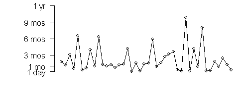
Notice that the number of data points is equal to the number of patients recruited. If you converted the data into the number of weeks between events or the number of months between events, you would still have exactly the same amount of data and exactly the same pattern..
This is the first advantage of recording the data as date gaps. It liberates you from having to worry about the time units–the chart for day gaps looks the same as the chart for week gaps, month gaps, etc.
Another advantage of using date gaps for monitoring accrual rates is that you don’t have to wait for an artificial calendar boundary to be crossed before you evaluate the data. Every time a new patient joins the research study, you have a new point on your graph.
Finally, the average date gap has a simple interpretation. When you sum all the date gaps, the terms telescope.
$G_1+G_2+…+G_n = $
$(D_1-0)+(D_2-D_1)+…+(D_n-D_{n-1} = D_n$
$\bar{G}=\frac{1}{n}D_n$
When you invert the average date gap, you get a familiar formula
$\frac{1}{\bar{D}}=\frac{n}{D_n}$
The numerator on the right hand side is the total number of patients recruited and the denominator is the total amount of time it took to recruit these patients. So the inverse of the average date gap is the overall recruitment rate. This is actually quite intuitive. If you have to wait an average of 15 days (0.5 months) between patients, you are recruiting 2 patients per month.
The control limits for a date gap chart have the same issues that control limits for a rate have.

The control limits are -5 months (-150 days) and 9.3 months (280 days). The center line is at 2.15 months (64 days). Since the date gap is inversely related to the accrual rate, large date gaps represent slower accrual rates. If you have to wait more than 9.3 months for the next patient in this clinical trial, that tells you that the accrual process has slowed substantially from the previous norm.
A log transformation for the date gaps
One intriguing possibility is to draw a control chart after a log transformation. The log transformation removes much of the skewness from the data.

The control limits for the log transformed data are interesting.
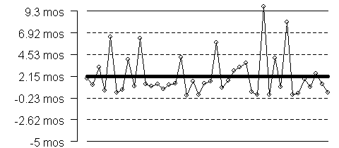
The control limits are at 0.5 days and 6.9 years (approximately 2500 days). Notice that the log scale places Zones B and C in the range of the data. The value at the low end of Zone C, 0.5 is intriguing. You could theoretically say that if two patients were recruited in the same day, that there was a gap of 0.5 days between them, and that if three patients were recruited in the same day, that there was a gap of 0.33 days between them. In order to fit the lower zones into the range of the data, though, you have to extend the upper zones. The upper control limit is now a disappointingly high value (6.9 years). Is this realistic and the 9.3 month limit on the original scale too liberal? Or is the 6.9 year value too conservative? I need to explore this further.
Other avenues for research
Once I develop a good model for accrual rates, I want to apply and adapt these methods to dropout rates. Is there a problem with excessive dropouts? Then the next natural extension is to adverse event reports. Is there a sudden surge in adverse events? I believe that a control chart represents a good way of tracking accrual, dropouts, and adverse events. I’m a bit leery of examining efficacy in a control chart, and when I have time, I want to document why efficacy might be different.
Also, I want to examine two group differences. Are we seeing a disproportionate number of dropouts in one arm of the study. I think that coding the events as +1 for the first arm of the study and -1 for the second arm of the study, and then cumulating this information over time will provide a continuous monitoring of whether a disproportionate impact is occurring. This becomes even more valuable when looking at safety data and adverse event reports.
There is a relationship between the control chart monitoring of adverse events and the traditional Number Needed to Harm (NNH) calculation used in Evidence Base Medicine. I need to establish and explore this link, because the NNH is the statistic that has a simple clinical interpretation. I would like to promote the control chart as a continual monitoring of NNH in a clinical trial.
Finally, I want to explore the use of CUSUM charts in monitoring accrual, dropouts, and adverse events in a clinical trial. There is not a lot written about CUSUM charts and there are a lot of variations to consider. The CUSUM chart is very good at showing gradual shifts in a work process. Also, the CUSUM chart appears to avoid some of the issues with interval size. If you select every third data point from a cumulative sum of monthly events that subset will be the same as a cumulative sum of quarterly events. A cumulative sum of date gaps is also intriguing, because of the telescoping that occurs when you add date gaps together. Finally, a deviation of the cumulative sum from a target value will rapidly show if you are consistently falling short of your goal. As such it might be a more sensible indicator of whether the original research plan needs to be reviewed or revised.
A good reference for CUSUM charts appears in section 6.3.2.3 of the NIST Engineering Statistics Handbook
Related pages on my web site