The classic follow-up to a significant F test in analysis of variance is examining all pairwise differences in means. It’s great for many problems, but sometimes you may not want to focus on all pairwise differences. Sometimes, there are so many pairwise differences that you get lost in all the clutter. Other times, you are trying to find out if, like the Sesame Street song, one of these groups is not like the others. Perhaps, you are trying to assure that groups conform to a common standard. Analysis of Means (ANOM) helps in all these settings.
The traditional hypothesis
You’ve seen this hypothesis for the standard ANOVA setting in your introductory Statistics class

This is a very common approach in a comparison of k independent groups. Test for any deviation from the null hypothesis using an F test. If this is statistically significant, then use a Tukey follow-up test to see which pairs of means differ from one another.
The comparison to the overall mean hypothesis
Suppose you are in a setting like the one described above, where there is an expectation of similarity between each group mean and the overall mean. Then you would write your hypothesis as

This approach is not that common, but you can find it in most statistical software programs under the name “Analysis of Means” or its acronym, ANOM. It fits in well with a setting where you hope that all the groups produce consistent results. If any do not, then you want to identify the group or groups that deviate from the norm and study factors that may account for the deviation.
The ANOM approach compares each group mean to the overall mean. It is easy to implement and it lends itself to a simple graphical display. You need a table of critical values, which depend on alpha (the overall Type I error rate), t (the number of groups), and n (the number of observations within each group). Some tables use the degrees of freedom for error in place of n.
You don’t need to compute the traditional F statistic for Analysis of Variance first, because the Analysis of Means approach controls the overall Type I error rate. This protects you from the accusation of p-hacking, even if the number of groups is very large.
It’s important to editorialize a bit here. Deviating from the norm could be a good thing or a bad thing or it could be an indifferent thing. Your goal is not to use statistics to hunt out different groups to reward or punish them. You are using statistics to help in understanding if deviations from the norm occur and then study those deviating groups to understand why they deviate.
A simple example
Imagine that you are a crop scientist, comparing five genetically modified strains of eggplant. You developed these strains to produce a natural insecticide, CryA1c, in the eggplant leaves.
You hope that all strains produce a comparable amount of insecticide. If any strain produces a lot more or a lot less insecticide, you will investigate full genetic profile of that strain to see why it is different from the others.

(Image taken from Wikipedia)
The data comes from
Desiree M. Hautea DM et al. Field Performance of Bt Eggplants (Solanum melongena L.) in the Philippines: Cry1Ac Expression and Control of the Eggplant Fruit and Shoot Borer (Leucinodes orbonalis Guenée). PLoS One. 2016; 11(6): e0157498.
and my description of the testing scenario is a bit simpler than the analysis done in that paper.
Here are the summary statistics.
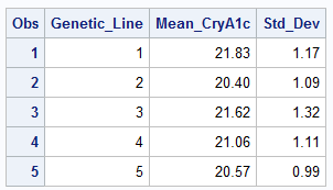
The raw data was not available, but you can calculate the analysis of means limits using the group means and standard deviations. You can plot the individual means versus the limits provided by analysis of means calculations.
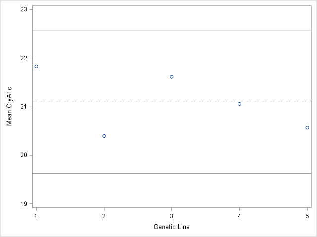
Notice that all five means lie inside the limits. None of the five strains shows a statisticially significant difference from the overall mean.
You may prefer a one-sided test in this setting, such as testing whether any strain is deficient in the CryA1c levels. You can make a very easy modification to get one-sided tests.
Caveats
The graph gets a bit messier if the sample size differs from one group to another.
More importantly, the only comparisons that you can make with the analysis of means approach is a comparison to the overall mean. If two groups are both statistically significantly higher than the overall mean, you cannnot make a comparison between those two groups without losing control of the overall Type I error rate.
You also need to specify the Analysis of Means hypothesis prior to looking at your data. Peeking at the data and then choosing your hypothesis is cheating.
The Analysis of Means provides a simple approach to testing a different type of hypothesis. Because it reduces the number of comparisons from all possible pairwise differences to a comparison of each group to the overall mean, you gain some precision and can summarize your results in a simple easily understood graph.
Details about the calculations
To get the limits for the graph shown above, you need the Analysis of Means table of critical values plus an estimate of Mean Squared Error. The general formula (as shown in this article) is
$\ $ $\bar Y_{..} \pm h(\alpha, t, N) \sqrt{(t-1)MSE/N}$
where $\bar Y_{..}$ is the overall mean and $h(\alpha, t, N)$ comes from a table such as this one (see page 3) or this one.
In our example alpha=0.05, t=5, and N=20. The original article does not provide MSE, but you can calculate it as the pooled variance using the descriptive statistics shown above. The limits are
$\ $ $21.1 \pm 2.88 \sqrt{(5-1)1.3/20}$
or
$\ $ $19.63$ and $22.57$