Dear Professor Mean,
I wanted to compare two groups in my research, those who completed every test battery, and those who completed only some of them. I ran ANOVAs on age, iq, adhd score, and so forth. My professor says that I should have used a t-test instead. Why can’t I use ANOVA. Isn’t ANOVA better than a t-test? –Angry Anastasia*
Dear Anastasia
When your grouping variable has two levels, the t-test and ANOVA are identical. It’s sort of like arguing over whether to buy twelve doughnuts or a dozen.
The time where there is a difference is when the group has three or more levels. Say, for example, that the group has levels A, B, C, and D. Then you could do a t-test on A vs B, A vs C, A vs D, B vs C, B vs D, and C vs D. That’s a lot of work. With ANOVA you get one test that examines whether the null hypothesis H0 muA = muB = muC =muD. The alternative hypothesis is that at least two of the means are unequal. That’s kind of vague, so if you reject the null hypothesis, then you should do some sort of follow-up test (like Tukey) to see exactly where the differences are.
If you take the t-statistic in the t-test and square it, you get the F-statistic in ANOVA.
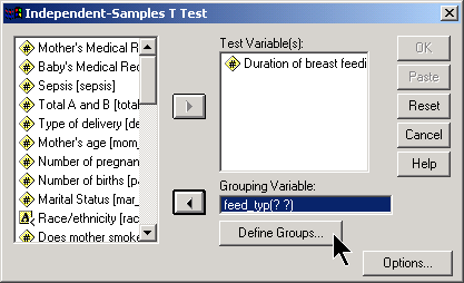
Here’s how you would run a t-test in SPSS. First, select ANALYZE | COMPARE MEANS | INDEPENDENT SAMPLES T-TEST from the menu.

In the dialog box, place the outcome variable in the TEST VARIABLE(S) field and the categorical variable in the GROUPING VARIABLE field. You then define what the two group levels are by clicking on the dialog box.
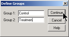
In this example, the groups are represented by the strings “Control” and “Treatmen”. Click on the CONTINUE button and then the OK button of the previous dialog box.
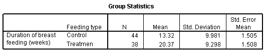
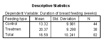
The output from SPSS starts out nicely enough. SPSS tells you that the control group has 44 patients, a mean of 13.32, a standard deviation of 9.981, and a standard error (standard deviation divided by the square root of the sample size) of 1.505. The treatment group has fewer patients, 38, and the mean is much larger. The standard deviation and standard error for the treatment group are roughly the same as the controls.
Unfortunately, the second table in SPSS is so wide that it is hard to display well on your computer screen or in the web page. I split the second table into four pieces.
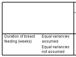
SPSS provides two different versions of the t-test. The first row, labeled “Equal variances assumed,” gives the traditional t-test, which uses a pooled estimate of variance. The second row, labeled “Equal variances not assumed,” gives an alternative version that uses a Satterthwaite approximation. I feel that presenting two versions of the same test is needlessly confusing, but unfortunately, SPSS does not give you a way to turn one or the other.
As a general rule, I encourage people to use the traditional t-test (Equal variances assumed row) unless you have a strong a priori reason to believe that the two groups have markedly different variances. Other people will recommend that you choose the Satterthwaite approximation (Equal variances not assumed row) because that test requires fewer assumptions. A third group of people will run a statistical test and then choose the row based on that statistical test.
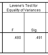
The second part of this table shows Levene’s test for equality of variances. I dislike Levene’s test for a variety of reasons, and it turns out that you can safely ignore this part of the table. If you belong to that third camp of people described above, then you would choose the Equal Variances Assumed row when Levene’s test was not statistically significant, and the Equal Variances Not Assumed row when Levene’s test was statistically significant. I dislike this approach, because it is the magnitude of the deviation from equality rather than the statistical significance of the deviation from equality that is important.
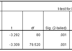
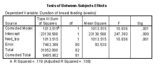
The third part of the table gives the t-test. I would usually select the t-test in the first row, but notice here that there is very little difference in the t-statistics, and the p-values are identical. Since the p-value is small, we would conclude that there is a statistically significant difference between the treatment and control groups in average duration of breast feeding.
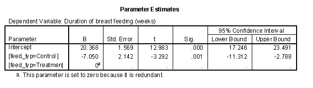
The final portion of the table provide the mean difference, the standard error for this difference and the confidence interval. SPSS computes the mean difference as Group 1 - Group 2. In this case, this means the control group minus the treatment group. If you prefer to compute the difference as Group 2 - Group 1, then simply negate and reverse the confidence limits. This would make the mean difference +7.050 and the 95% confidence interval would be 2.788 to 11.312.
Since the 95% confidence interval excludes the value of zero, we would conclude again that there is a statistically significant difference between the treatment and control groups. Furthermore, this difference is large–at least 2.8 weeks, even after allowing for sampling error.
Now let’s compute the same statistic using an ANOVA model. Select ANALYZE | GENERAL LINEAR MODEL | UNIVARIATE from the SPSS menu.
Be sure to click on the OPTIONS button.
The output appears in several nicely formatted tables.
Next
Then
Finally,
The situation changes, however, when you have three or more groups. Here is some data on critical flicker frequency measured on nineteen people. According to the web page where I got this data
An individual’s critical flicker frequency is the highestfrequency at which the flicker in a flickering light source can be detected. At frequencies above the critical frequency, the light source appears to be continuous even though it is actually flickering. –Description taken from the OzDASL website
In this data set, the eye color was recorded along with the critical flicker frequency. Here is a boxplot of the data.
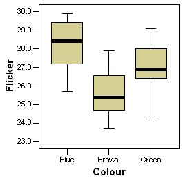
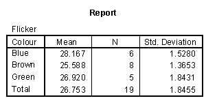
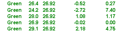
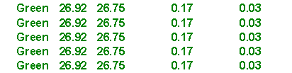
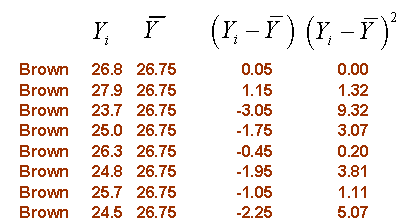
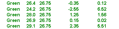
Notice that brown eyes tend to have the low flicker frequency and blue eyes tend to have high flicker. Here are the means and standard deviations for the three groups.
It looks like there is a large difference between these three groups, but could this be caused by sampling error? To answer this question, you have to compute how much variation there is among these three means and compare that to variation within each group.
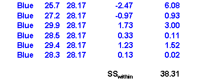
Variation within groups is often called within subject variation or error variation and is denoted by SS~within~ or SSW. Another abbreviation commonly used is SSE, with the E standing for Error.
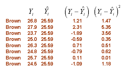
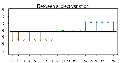
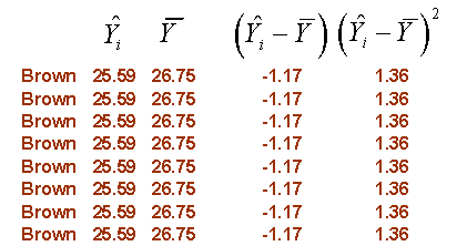
Within subject variation is a measure of the deviation of each individual data point from the mean for each group. The figure below shows these deviations for the flicker data set.
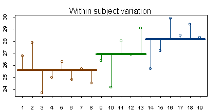
You can consider the mean for each group (the brown, green, and blue lines shown above) as the predicted value based on group knowledge. In other words, if you only knew the color of a person’s eyes, your best estimate for flicker would be the average that you observed for that particular eye color. The symbol ^ above Y represents the predicted value. Here are the calculations for within subject variation:
The calculations shown above may be slightly different from the ones you have seen before. The formulas shown here have an easy generalization to more complex ANOVA and regression models.
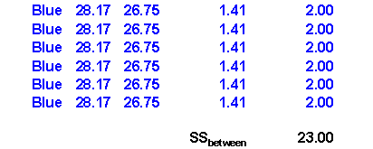
Variation among the group means is often called between subject variation and is denoted by SS~between~. or SSB
Between subject variation is a measure of how much the group means differ from the overall mean. The figure below shows these deviations for the flicker data set.
Here are the calculations for variation between groups (SSB)
ANOVA models will usually also present a third source of variation, total variation, whic is denoted by SS~Total~ or SST.
Total variation is a measure of how much the individual values differ from the overall mean. The figure below shows these deviations for the flicker data set.
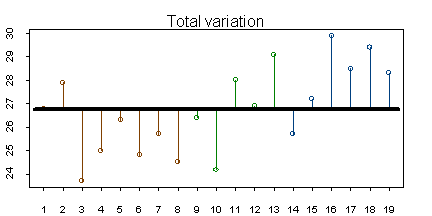
Here are the calculations for total variation (SST)
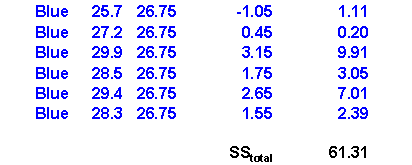
Notice that SST (61.31) is equal to SSW (38.31) plus SSB (23.00).
With a bit of algebra, you could show that total variation is always equal to between subject variation plus within subject variation. Each of the three sources of variation has degrees of freedom associated with it.
Between subject variation and within subject variation are often called “explained” and “unexplained” variation, respectively. Explained variation is the variation that can be accounted for by using the group means and the remaining vaation is unaccounted for. The ratio of explained variation to total variation is known as R-squared. A value close to 1 indicates that your ANOVA model has accounted for most of the variation in the data. This is good news! A value close to 0 indicates that your ANOVA model has accounted for very little of the data. When R-squared is small, you should consider measuring other variables and factors that may explain more of the variation in your data.
In this example, R-squared is 23.00 / 61.31 = 0.38. Roughly 38% of the variation in critical flicker rate can be accounted for by eye color.
Degrees of freedom and mean squares
The degrees of freedom represent the number of independent pieces of information used to compute that source of variation. Typically, it is the number of data values minus the number of estimated parameters. For example, the calculation for within subject variation used all 19 data points, and had 3 estimated means, so the degrees of freedom would be 16. The calculation for between subject variation used not the 19 data points, but the 3 group means.<U+FFFD> We estimated the deviation from a single overall mean. So the degrees of freedom for between subject variation is 3-1=2. By a similar argument, the degrees of freedom for total variation would be 18.
If you let N equal the number of data points in your sample and K equal the number of groups in your sample, then the degrees of freedom for within, between, and total variation would be N-K, K-1, and N-1 respectively.
When you divide a source of variation by its degrees of freedom, you get a mean square, which is a type of adjustment to each source of variation for the sample size and complexity of your ANOVA model.
The mean squares provide several valuable estimates in your ANOVA model. For example, the square root of MSW is a good estimate of the standard deviation of the error terms in your ANOVA model. Most of formulas for confidence intervals in the ANOVA model will include this term.
The ratio between MSB and MSW, often called the F Ratio, is another important statistic.
The F Ratio is a measure of whether the variation between the group means is large or small relative to sampling error. When the F Ratio is close to 1, there is little evidence of differences between the groups, since the differences among the group are about the size that you would expect just from sampling error. When the F Ratio is large, there is strong evidence of statistical differences between the groups, much larger than could be accounted for by sampling error.
SPSS and most other statistical software will summarize all of the statistics described above in an ANOVA table. The general form of the ANOVA table is
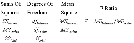
Here is how SPSS displays the ANOVA table. SPSS provides additional information in the first, second, and fifth rows of this table, which really isn’t too important for most situations. The third, fourth, and sixth rows of the SPSS table represent what is traditionally reported.
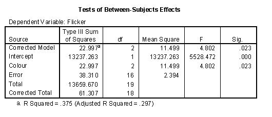
For this table, the F ratio is 4.802 (remember that we are ignoring the first two rows of the ANOVA table). This is a large value, and the p-value is 0.023, which is small and statistically significant. Therefore, we would conclude that there is indeed a difference among the three eye colors in the average critical flicker frequency.
Notice the R Squared value listed at the bottom of this table which matches the value that we calculated above. Adjusted R Squared is similar measure to R Squared with an adjustment based on the degrees of freedom in the model. The adjustment provides a bit of discouragement from using overly complex models, but selecting between models with differing levels of complexity is Adjusted R Squared provides a moderate penalty for overly complex models. This is good, but perhaps the penalty for complexity needs to be stiffened. Selecting among different ANOVA models is quite challenging.
Estimating mean differences
Once you have established the statistical significance, you should examine the size of the differences between the group means. To do this effectively, you need to create indicator variables.
An indicator variable has two possible values, 1 and 0, representing the presence or absence of some value. Indicator variables are very useful for understanding how categorical variables behave.
In the flicker data set, there are three possible indicator variables. You can indicate the presence of absence of brown eyes, of green eyes, or of blue eyes. Here’s how you would create an indicator variable for brown eyes. First, select TRANSFORM | COMPUTE from the SPSS menu. A dialog box like the one shown below will appear.
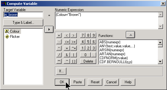
The numeric expression (Colour=“Brown”) runs a test on each row of the data. When the test is true, a value of 1 is computed and when the test is false, a value of 0 is computed. You create indicator variables for green and blue by changing the numeric expression to (Colour=“Green”) or (Colour=“Blue”).
Be careful with this approach if you have any missing values for Colour.
Another approach that works well for creating indicator variables is to select TRANSFORM | RECODE | INTO DIFFERENT VARIABLES from the SPSS menu.
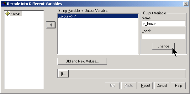
Put the name of the indicator variable in the OUTPUT VARIABLE window and click on the CHANGE button. Then click on the OLD AND NEW VALUES button. This brings up another dialog box.
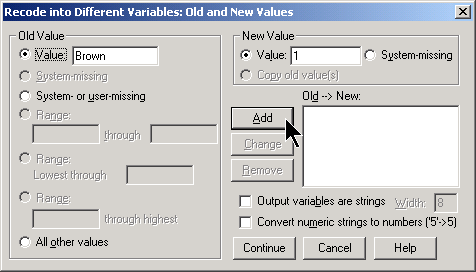
Designate the category of interest in the OLD VALUE field and use 1 in the NEW VALUE field. Then select the SYSTEM OR USER MISSING option button on the left side and the SYSTEM MISSING option button on the right side. Finally, select the ALL OTHER VALUES option button on the left side and use 0 in the NEW VALUE field. When you are finished, the dialog box should look like this:
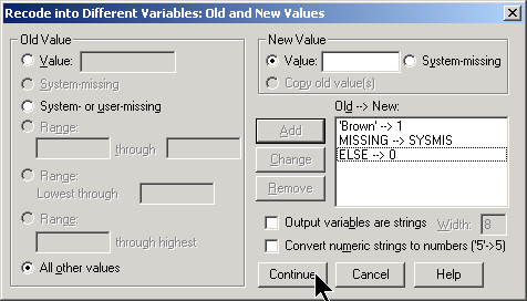
Click on the CONTINUE button and then the OK button.
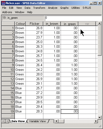
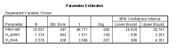
Although it is possible to create three different indicator variables for the three different eye colors, it turns out that only two indicators are really needed. Let’s create a second indicator for green eyes, but leave out (for now) the indicator for blue eyes. Here’s what your data set looks like after you create these two indicator variables.
To estimate differences in means, use the two indicator variables as covariates in a general linear model.
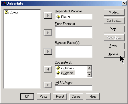
Normally, you would reserve the covariate field for continuous variables, but it turns out that indicator variables also work well here. Be sure to click on the OPTIONS button and select DESCRIPTIVE STATISTICS and PARAMETER ESTIMATES in the dialog box that opens.
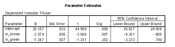
The interpretation of this table is interesting. The intercept equals the average flicker for blue eyes. The slope for the indicator for brown eyes equals the average difference between brown and blue (-2.579 = 25.588 - 28.167). The slope for the indicator for green eyes equals the average difference between green and blue eyes (-1.247 = 26.920 - 28.167). It turns out that the one indicator out of the three that you leave out of the model ends up being the center of attention!
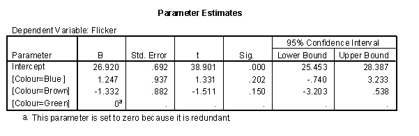
Suppose that we had included indicators for green and blue. The parameter estimates change to the following:
The intercept is now the average for brown and the indicators represent the average differences of green from brown (1.333 = 26.920 - 25.587) and blue from brown (2.579 = 28.167 - 25.587).
When you run an ANOVA model, you have to decide to leave one of the indicator variables out. The category for that indicator becomes the reference level, and all comparisons will be made with respect to this reference level.
The choice of reference level is not always obvious. If one of the categories represents a control group, then this is a logical choice.
If you include the variable “Colour” as a fixed factor, what does SPSS do? It turns out that SPSS will choose the largest value as the reference level. With strings, the largest value is the one that appears last in alphabetical order.
Confidence interval
The table of parameter estimates provides simple confidence intervals for the mean differences, but there are two problems with this. First, with three groups, the parameter estimates table only produces two of the three possible differences that you might be interested in. If there are four groups, you would use three indicator variables, but there are actually six possible comparisons between pairs of means.
Second, when you compute multiple confidence intervals, the overall confidence level across all the intervals will be less than 95%. If each interval has a 5% chance of being wrong, then if you compute multiple intervals, you will accumulate a greater chance for error.
There are several modifications for these confidence intervals that try to insure that the overall confidence level remains at 95%. Click on the POST HOC button in the general linear models dialog box to see what your options are.
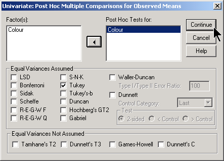
In this example, the TUKEY option was chosen. Tukey works well when you are interested in examining differences between all possible pairs of means. If you wish instead to compare each group to a control group, then the DUNNETT option works well. Just make sure that your control group is either the last (that is, largest) value or the first (smallest) value.
Here is part of the output.
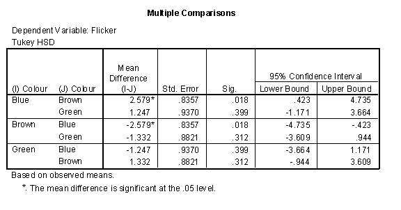
There are six rows in this table, but half of them are simply reversals. For example, the confidence interval for Brown - Blue is (-4.735, 0.423), but this is just the reversal of the confidence interval for Blue - Brown (-0.423, 4.735) just two rows above it.
At first glance, you may notice an apparent contradiction in these confidence intervals. There is no statistically significant difference between Blue and Green, since the confidence interval (-1.171, 3.664) includes the value of zero. Similarly there is no statistically significant difference between Green and Brown. But there is a statistically significant difference between Blue and Brown. How can this be?
It turns out that the differences between Blue and Green and the differences between Green and Brown are around 1.3, which well within the range of sampling error. But the difference between Blue and Brown is about 2.6, which is beyond the limits of sampling error.
One way to think of this is that the confidence intervals are measuring closeness rather than equality. Just because Blue is close to Green and Green is close to Brown does not imply that Blue is close to Brown.
SPSS also produces a list of homogenous subsets.
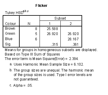
This list shows groups of means which would close enough together to be considered within the range of sampling error. This list recpas the findings that we discussed above. Blue and Green form a homogenous subset because their means are within the range of sampling error. Green and Blue form a second homogenous subset.
Be cautious about the interpretation of this table when the sample sizes are not close to the same size. If there are two groups with much smaller sample sizes and these groups have means at the extremes, they may make all the other means in between appear to be homogenous, even though the larger sample sizes for these intermediate means might have far less sampling error.
Analysis of multiple factors
When you have more than one factor to consider in an ANOVA model, the statistics become considerably more complex.
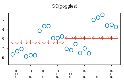
The graph above shows data for a study of swimming times in a 25 meter pool. This experiment looked at three factors which might influence swim times:
- Goggles (On = +; Off = -),
- Flippers (On = +; Off = -),
- Tee Shirt (On = +; Off = -).
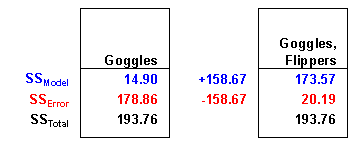
The horizontal axis has eight tick marks corresponding to the eight possible combinations of goggles, flippers, and shirt. The circles represent the actual swimming times. The flat side of the arrow represents what you would predict the time to be ignoring any of the three factors–19.72, which is the overall mean for all 24 swimming times. The pointed side of the arrows represent what you would predict if you knew the value for goggles. Swim times are 0.79 minutes less if goggles are on (18.93 = 19.72 - 0.79) and 0.79 minutes more if the goggles are off (20.51 = 19.72 + 0.79). Notice that the improvement in prediction is very modest. You can quantify the improvement as SS(goggles) = 24 * 0.79^2 = 14.98. The ANOVA table in SPSS (see below) produces a slightly smaller value, 14.90, because the calculations above have a bit of rounding error.
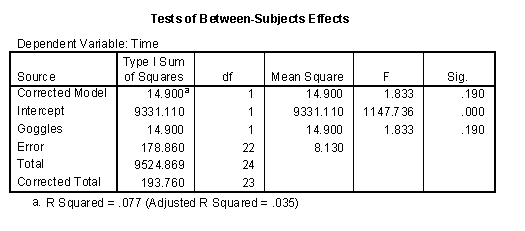
Notice that there is a lot of room for improvement. Total variation is 193.76, so a model with goggles in it accounts for only 14.90 / 193.76 = 7.7% =of the variation.
How much better would the prediction be if we also accounted for the second factor, flippers?
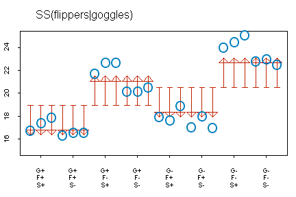
The graph above shows the improvement from a model that includes goggles only (flat end of the arrow) to a model that includes goggles and flippers (pointed end of the arrow). Notice here how much the predicted values change. If flippers are on, the predicted values decrease by 2.57 minutes and if flippers are off, the predicted values increase by 2.57 minutes. With two factors, notice that the predictions can equal four separate values. You can quantify the improvement as SS(flippers | goggles) = 24*2.57^2 = 158.52. The ANOVA table in SPSS (see below) produces a slightly different value, 158.67, again because of rounding error.
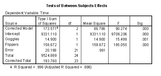
Notice that the model with both goggles and flippers is a much better model. The variation accounted for by two factors combined is 14.90+158.67 = 173.57 and this represents 173.57 / 193.76 = 89.6% of the total variation.
Can we do better by including the third factor, shirt?
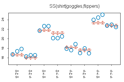
The graph above shows the improvement from a model that includes shirt and goggles to a model that includes shirt, goggles, and flippers. The changes are small, but are working towards a slightly better prediction. Predicted values with a shirt on are 0.69 minutes larger and predicted values with a shirt off are 0.69 minutes smaller. The size of this improvement is quantified as SS(shirt | goggles, flippers) = 24 * 0.69^2 = 11.43. The table in SPSS has a slightly different value, 11.30, because the calculations above have some rounding error.
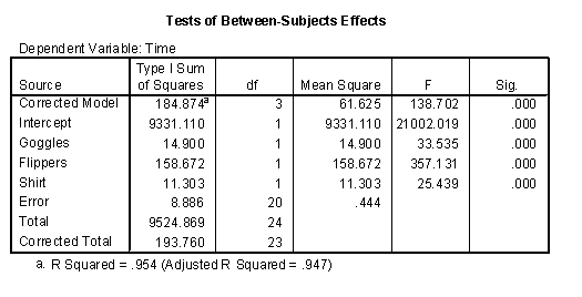
The model with three factors predicts very well. The three factors combined account for variation of 14.90 + 158.67 + 11.30 = 184.87, which is 184.87 / 193.76 = 95.4% of total variation. This leaves unaccounted variation of only 193.76 - 184.87 = 8.89.
Sequential versus partial SS
The calculations shown above involve a sequence of models. The table below summarizes the changes in this sequence of models:
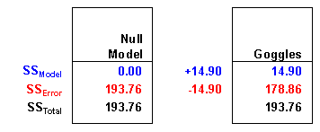
A single factor model with goggles represent a 14.90 unit increase> over nothing.
A two factor model with goggles and flippers together represent a 158.67 unit improvement over the single factor model.

A three factor model with goggles, flippers, and shirt represents an 11.30 unit improvement over the two factor model.
Notice that the increase in SS(Model) is matched by a corresponding decrease in SS(Error). There is a corresponding decrease in unaccounted variation whenever your model improves.
Calculating a sequence of increasingly complex models will produce sequential SS, which is also known as Type I SS. Sequential SS are easy to understand, but sometimes the sequence of variables is somewhat arbitrary. Why did you place goggles in the model first and shirt last? Would a different order (shirt first, then shirt plus goggles, then shirt plus goggles plus flippers) make more sense?
With this particular data set, it turns out that there is not any difference, but in other cases, the sequence does indeed change things. Another approach to ANOVA models is to use partial SS, also known as Type III SS. Partial SS compares the predictive ability of a model with all factors to a model with everything except the factor of interest. This measures the effect of a factor above and beyond all the other factors in the model. Partial SS answers the question, how much variation does this factor account for after variation for all the other factors have been removed.
Here’s an example of partial SS calculations:

A two factor model without goggles accounts for 169.97 units of variation. A model with all three factors accounts for 184.87 units of variation. This is an improvement of 14.90 units.
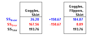
A two factor model without flippers accounts for 26.20 units of variation. A model with all three factors accounts for 184.87 units of variation. This is an improvement of 158.67 units.
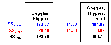
A two factor model without shirt accounts for 173.57 units of variation. A model with all three factors accounts for 184.87 units of variation. This is an improvement of 11.30 units.
Are conclusions do not change at all with the use of partial SS. The factor, flippers, is the most important variable because it accounts for most of the variation. With this data set, it doesn’t matter whether flippers comes first, last, or in between. Partial SS are especially important for complex ANOVA models. This includes models with unbalanced sample sizes and models with a mix of continuous and categorical variables.
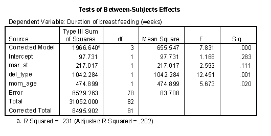
Here’s an example of where the sequence of models is very important. In a study of breastfeeding, two important categorical factors are delivery type (C/S vs VAG) and marital status (married vs single). An important continuous variable is mother’s age. The dependent variable is the duration of breast feeding.
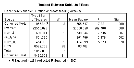
When marital status appears first in sequence, it accounts for 640 units of variation..
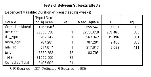
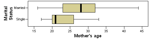
When marital status appears last in sequence, it accounts for only 217 units of variation. One possible explanation for this finding is that there is some overlap between marital status and mother’s age. Married mothers tend to be older than single mothers (see the box plot below). Thus some of the variation accounted for by marital status could perhaps be also accounted for by mother’s age. Notice that the SS for mother’s age increased from 475 to 787 when it appears in the model before
Partial SS or Type III SS are often thought of as conservative. A factor gets a piece of the pie only after all the other factors have taken their piece first. Usually the partial SS are smaller than the sequential SS, but not always. Notice for example, that the partial SS for delivery type is 1042, which is bigger than the SS when this factor enters the model first (962) or second (852).
Analysis of interactions
When you have multiple factors in an ANOVA model, you may wish to examine interactions. An interaction is a combination of two or more factors where the joint effect of these factors is not equal to the sum of the individual effects.
Here is an ANOVA model with two factors and an interaction. The effect of the interaction is not quite, but close to statistical significance.
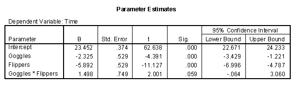
What does this interaction mean. Let’s look at a plot showing the time without goggles as red circles and the time with goggles as black plus signs. The left side of the graph is the times without flippers and the right side of the graph is the times with flippers. A red dashed line connects the average times without goggles and a black dotted line connects the average times with goggles.
The example shown her is an antagonistic interaction.
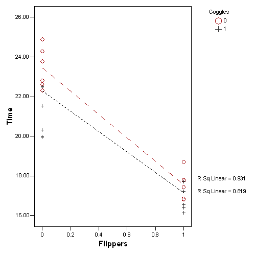
A few things are obvious right off the bat. First the red dashed line is higher than the black dotted line. This is not a surprise. We know that wearing goggles improves your time. Second, both lines have a negative slope. This again, is not a surprise as wearing flippers also improves your time. Third, these lines are not parallel. Flippers give you more of an improvement when you don’t also have the advantage of goggles. The converse is true as well. The gap between the two lines shrinks, meaning that the edge that goggles gives you is more prominent when you don’t also have the advantage of wearing flippers.
There are two types of interactions: synergistic versus antagonistic. A synergistic interaction is one where the combination of two factors gives you more than you would expect from simply adding the effect of the first and second factor. You could call this a super-additive interaction.
An antagonistic interaction is one where the combination of two fractos gives you less than you would expect from simply adding the individual effects. You could call this a sub-additive interaction.
You can also look at the graph with the flippers and goggles reversing roles.
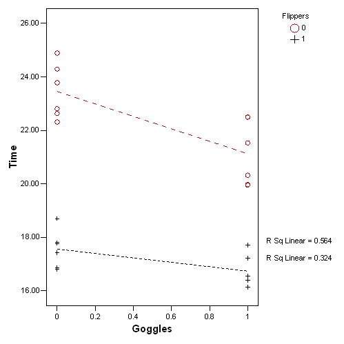
Normally it is not necessary to look at things both ways. They will normally lead to the same general interpretation.
You can find an earlier version of this page on my original website.