I’m working with a group that is tracking central line infections over time. There were 22 infections over the previous year, and the infants were divided into five risk groups. For this example, I am ignoring the risk groups.
 ev#  gp      day   | ev#   gp         day
 1     4       24   | 12     2         113
 2     4       43   | 13     1         137
 3     4       43   | 14     3         153
 4     4       46   | 15     5         165
 5     1       47   | 16     1         185
 6     2       55   | 17     1         195
 7     5       55   | 18     1         228
 8     4       71   | 19     1         342
 9     5       90   | 20     2         342
10     5       91   | 21     4         343
11     4      102   | 22     1         363
There are a varying number of patients with central lines being cared for at any given time. The number of central line days in each month is
month   all   gp1  gp2  gp3 gp4 gp5
 1       593   70    0   67 188 268
 2       624   66   48   53 222 235
 3       704   44   69   75 231 285
 4       578    0   80   32 115 351
 5       582   38   62   61 140 281
 6       441  104   36   51  82 168
 7       384   64   28   38  72 182
 8       521   47  156   24 103 191
 9       459   35   50   23 122 229
10       562   23   51  108  93 287
11       531   46   70   67  59 289
12      1581  178  193  229 204 777 `
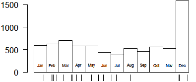
Here is a plot showing central line infections and the number of central line days in each month.

Notice that each month has a few events, except for September, October, and November. Also notice that the number of central line days is almost three times as high in December than in any other month. It turns out, after later review of this data, that the surge in December was just a bookkeeping error. I am keeping it in this teaching example because it illustrates the importance of considering adjustments for sudden changes in work volume.
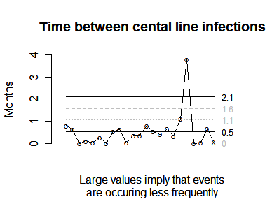
A control chart tracking the frequency of these adverse events would look like

Notice that we created a pseudo event at the end of the year to track the amount of time from the last event to the end of the calendar. This pseudo event is marked with an X.
The average waiting time between events is 0.5 months and the 19th event is unusual in that we had to wait almost 4 months between that event and the previous event. Something unusual happened at the end of summer that caused a welcome drought in central line infections.
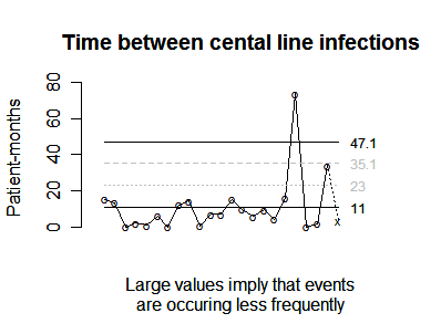
You should consider whether the trends change when you account for the unusually high workload in December, and here is a control chart that looks at the number of patient years between events.

Notice that on average, you have 1.1 events per patient year.
I am still working on some graphs that show that central line infections occur more frequently in the lower birthweight groups.
How can you construct a graph like this?
The graphs shown above require computing of date gaps or waiting times. There are some special considerations when two or more events occur on the same day. You can then compute the average date gap and plot the data on a log scale. When there are variations in the number of patients seen or the volume of work done, then you can adjust these values by prorating the workload among the date gaps.
Computing date gaps or waiting times.
The first graph displays the date gaps (also called waiting times) between successive events. The first event occurs on January 24, so you waited 23 days from the beginning of the calendar year (January 1). The second event occurs on February 12. There are 7 days left in January, and when you add that to the 12 days in February, you get a date gap of 19 days.
Two or more events on the same day.
There are actually two events on February 12. How do you handle two or more events on the same day? There are several approaches that work reasonably well. The one I like is to consider that an event that occurs on a given day occurs at a random time between 0 hours and 24 hours. We don’t know what that time is, so for convenience, we set the time to 12 hours or noon. If there were two events on the same day, you could place both events at noon, but then you have a zero difference, which leads to some complications. Instead, place one of the events at 6 hours and the other at 18 hours. If three events occur on the same day, place the first event at 4 hours, the second at 12 hours and the third at 20 hours. If four events occur on the same day, place the first event at 3 hours, the second at 9 hours, the third at 15 hours and the fourth at 21 hours.
With two events on the same day, this approach effectively sets the waiting time between the two events at half a day. This seems intuitive enough–the events could be separated by no more than 24 hours and no less than 0 hours, so a good compromise is to split the difference. When you use this approach, the “extra” half day is effectively taken from the date gaps on either side. So the number of days between Jan 24 and the first event on Feb 12 is actually 18.75, not 19 and the number of days between the second event on Feb 12 and the event on Feb 15 is actually 2.75 rather than 3.

The graph shown above illustrates how the waiting times between events would be calculated if you made no adjustments for multiple events on the same day. The three waiting times between events occurring on Jan 24, Feb 12, Feb 12, and Feb 15 would be 19, 0, and 3.

This graph shows how you would adjust for two events on the same day. A value of 0.5 days is assigned to the waiting time between two events occurring on Feb 12. The waiting time between Jan 24 and the first event on Feb 12 is reduced from 19 days to 18.75 days. The waiting time between the second event on Feb 12 and the event on Feb 15 is reduced from 3 days to 2.75 days.
If you continue with the rest of the calculations, the date gaps are
  23.00
  18.75
   0.50
   2.75
   1.00
   7.75
   0.50
  15.75
  19.00
   1.00
  11.00
  11.00
  24.00
  16.00
  12.00
  20.00
  10.00
  33.00
 113.75
   0.50
   0.75
  20.00 `
There is a small amount of time left over at the end of the calendar year (3 days to be precise). Although it is not unreasonable to just ignore those 3 days, in some cases you can end up ignoring valuable information. So place a pseudo event on December 31. The last date gap, 3 days, represents a lower bound, we know that we will have waited at least 3 days from December 28 to the next event.
Computing the average date gap.
The date gaps form a telescoping sum, and the total is simply the difference between the starting date of the time window and the ending date of the time window. In our case, this value is 365 days.
When you compute the average date gap, this represents length of the time window divided by the number of events. In our case, the numerator is 365 and the denominator is 23 (remember that we placed a pseudo event at the end of the calendar year), which produces an average date gap of 15.9 days. If you reversed the order of the division, placing 23 in the numerator and 365 in the denominator, you would get 0.063, an estimate of the daily rate of central line infections. Multiply by 365 to get 23, the estimated yearly rate.
There is a certain intuition to these calculations. Event rates and waiting times are inversely related. A high event rate implies a short waiting time between events. A low event rate implies a long waiting time between events.
Log transformation.
The date gaps are typically skewed, so I use a log transformation on the data. I also reverse the scaling so that small date gaps appears at the top of the group and large date gaps appear at the bottom. This orientation makes improvements in quality (bad events occur less frequently and with larger date gaps) appear as values near the bottom of the graph and declines in quality (bad events occur more frequently and with smaller date gaps) appear as values near the top of the graph.
Adjusting date gaps for the volume of work done.
When there is substantial variation in the number of patients seen or the amount of work done, then you can adjust the date gaps using simple linear interpolation. You may be more familiar with this approach as “prorating” or dividing in a proportionate fashion.
The first event occurred on January 24. There were 593 patients days in that month, so the prorated proportion of time until January 24 is
593 * (23/31) = 439.97.
The second event occurred on February 12, so that gets the remainder of the January patient days plus a prorated proportion of the February patient days.
593 * (8/31) + 624 * (10.75/28) = 392.60.
The half day between the first event on Feb 12 and the second event on Feb 12 translates into
624 * (0.5/28) = 11.14.
The full list of adjusted date gaps are
  439.97
  392.60
   11.14
   61.29
   22.29
  172.71
   11.14
  355.66
  431.48
   22.71
  211.93
  211.93
  454.52
  296.31
  176.40
  287.06
  123.87
  475.06
 2165.15
   25.50
   38.25
 1020.00
  153.00
Note that this is also a telescoping sum. When you add all the values together, you get 7,560 patient days, which is the total number of patient days across all twelve months. The average is 328.7 patient days or 0.9 patient years. This tells you that you accumulate a bit less than a full patient year between successive central line infections. The inverse value is 1.11. You estimate that there are 1.11 infections per patient year of exposure.
Placing control limits on the chart.
You can place control chart limits on this graph to determine when a sudden change in the infection rate has occurred. The average date gap (or adjusted date gap) represents the center line of the control chart. This is the easiest and also the most important reference line to compute. A classic rule for control charts is to declare a special cause whenever you see eight consecutive data points on the same side of the center line.
As a technical note, this rule was developed for symmetric distributions. The waiting time is usually skewed, and research needs to be done to identify whether the rule of eight consecutive points on the same side of the center line still applies or if a slightly different rule (e.g., nine consecutive points above the center line or six consecutive points below the center line) might produce better results.
The control limits can be computed using several different ways. Waiting times often follow an exponential distribution, and you can compute limits based on this distribution. Another approach is to use an individual value control chart (an XmR chart). The XmR chart requires the computation of a moving range, a range between pairs of consecutive data values. The first four date gaps are
  23.00
  18.75
   0.50
   2.75
so the first three moving ranges are
|23.00-18.75| =  4.25
|18.75- 0.50| = 18.25
| 0.50- 2.75| =  2.25
The entire list of moving ranges is
    4.25
   18.25
    2.25
    1.75
    6.75
    7.25
   15.25
    3.25
   18.00
   10.00
    0.00
   13.00
    8.00
    4.00
    8.00
   10.00
   23.00
   80.75
  113.25
    0.25
   19.25
   17.00
The average of these moving ranges is 17.4. The formula for the control limits is
15.9 +/- 2.660 * 17.4.
The lower limit is negative and will be ignored (a negative lower limit on an XmR chart with skewed data is not uncommon). The upper control limit is 62 days, which corresponds to an infection rate of 6 per year. What this limit tells you is for this process anytime you go more than two months without an infection, you need to investigate. The process may have suddenly improved, though you also need to be on the lookout for a tendency to underreport problems.
Note that the graph above used months rather than days between events. This is simply a linear transformation (divide everything by 30).
The adjusted date gaps are
  459.1
  401.3
    0.0
   66.9
   22.3
  178.3
    0.0
  361.7
  431.5
   19.3
  211.9
  211.9
  454.0
  292.2
  176.4
  284.7
  123.9
  479.5
 2212.1
    0.0
   51.0
 1020.0
  102.0
and the average adjusted date gap is 328.7. The moving ranges for the adjusted date gaps are
    57.8
   401.3
    66.9
    44.6
   156.0
   178.3
   361.7
    69.8
   412.2
   192.7
     0.0
   242.1
   161.8
   115.8
   108.3
   160.9
   355.6
  1732.6
  2212.1
    51.0
   969.0
   918.0
and the average moving range is 407.7. The upper control limit is
328.7 + 2.660 * 407.7 = 1413.2.
Divide every value by 30 to get estimates in patient months rather than patient days.
You can find an earlier version of this page on my old website.