Dear Professor Mean, I have some data that don’t seem to meet the assumption of normality. What should I do?
Dear Reader,
There are no official rules. Here are my highly opinionated thoughts on the issue.
Avoid using a test of significance, because it has too much power when the assumption of normality is least important and too little power when the assumption of normality is most important.
I generally don’t get too excited about skewness unless it is larger than +/- 1 or so.
SPSS defines kurtosis in a truly evil way (remember what I said above about highly opinionated) by subtracting 3 from the value of the fourth central standardized moment. A value of 6 or larger on the true kurtosis (or a value of 3 or more on the perverted definition of kurtosis that SPSS uses) indicates a large departure from normality. Very small values of kurtosis also indicate a deviation from normality, but it is a very benign deviation. This indicates very light tails, as might happen if the data are truncated or sharply bounded on both the low end and the high end.
Don’t let skewness and kurtosis prevent you from also graphically examining normality. A histogram and/or a Q-Q plot are very helpful here.
The type of non-normality and the type of test is important here. Also, if you are using an ANOVA or regression model, the important thing is the normality of the residuals not the normality of the raw data.
It also depends how risk averse you are. Some people immediately flee for the security of non-parametric tests when the slightest thing looks bad. Others stay with parametric tests until things get really extreme. Some people will try transformations are every opportunity and others shun any transformations at all.
Look at the standard used in journals in your area to get a feel for whether you should be extra cautious or not.
The simplicity of using the same test for all 16 variables may be the most important consideration here. But whatever choice you make, resign yourself to the fact that the referees of the journal you submit your results to will ask you to change to the other approach.
Some people advocate running two or more tests simultaneously as a sort of sensitivity analysis. If you get pretty much the same results using a t-test and the Mann-Whitney-Wilcoxon test, then you can sleep well at night. If the two tests differ then you can investigate why they differ.
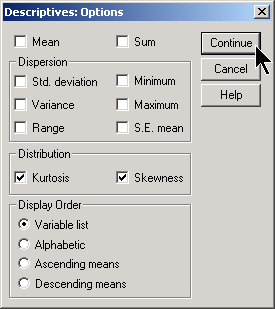
To compute the skewness and kurtosis, select ANALYZE | DESCRIPTIVE STATISTICS | DESCRIPTIVES from the SPSS menu. Then click on the OPTIONS button.
Here is the output.

The skewness is close to zero, indicating that the residuals are roughly symmetric. The kurtosis is very small. This tells you that the data are non-normal.
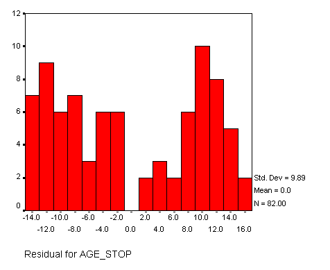
A histogram can also give you an indication about normality. Here is a histogram for the same set of residuals. Notice that this histogram does not resemble a bell shaped curve. The deviation from normality, however, is not very troublesome. It would have been more of a concern if the histogram showed evidence of one or more outliers.
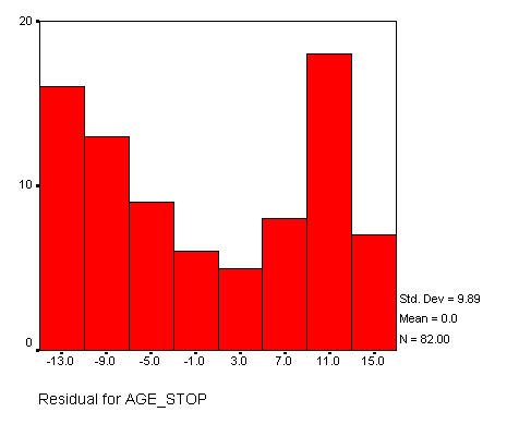
One trouble with histograms is that the width of the bars is somewhat arbitrary. Here is an example of a histogram with wider bars.
And here is an example of a histogram with narrower bars.
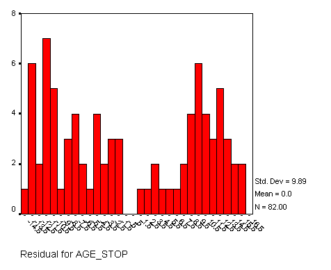
There is no simple way to select the width of the bars, and a pattern that may be hidden in one histogram may appear when the bars gets wider or narrower.
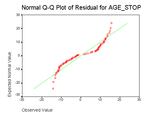
A graphical alternative to the histogram is the Q-Q plot. This display plots the data values versus evenly spaced percentiles from a normal distribution. If the Q-Q plot shows a line that is If there is a good correspondence between the data
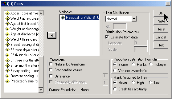
Here is the Q-Q plot for the residuals from a linear regression model.
You can find an earlier version of this page on my original website.