I have an R cheat sheet, How Big Is Your Graph, that explains how to measure the size of various features of your graph in R. This blog post illustrates how you can use some of the commands described in that cheat sheet to draw a perfect circle.
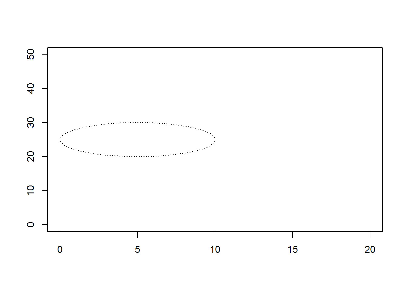
When you try to draw a circle on a graph, it often ends up looking like an ellipse. Here’s an example.
draw.circle <- function(x0, y0, r, ...) {
  # draw a circle of radius r centered at x0, y0
  pi.seq <- seq(0, 2*pi, length=100)
  x.circle <- x0 + r * cos(pi.seq)
  y.circle <- y0 + r * sin(pi.seq)
  polygon(x.circle, y.circle, ...)
}
plot(0, 0, xlim=c(0, 20), ylim=c(0, 50), type="n", xlab=" ", ylab=" ")
draw.circle(5, 25, 5, lty="dotted")
text(5, 80, "r=5 (usr)")
 {width=“448” height=“320”}
dv <- dev.size()
ma <- par("mai")
us <- par("usr")
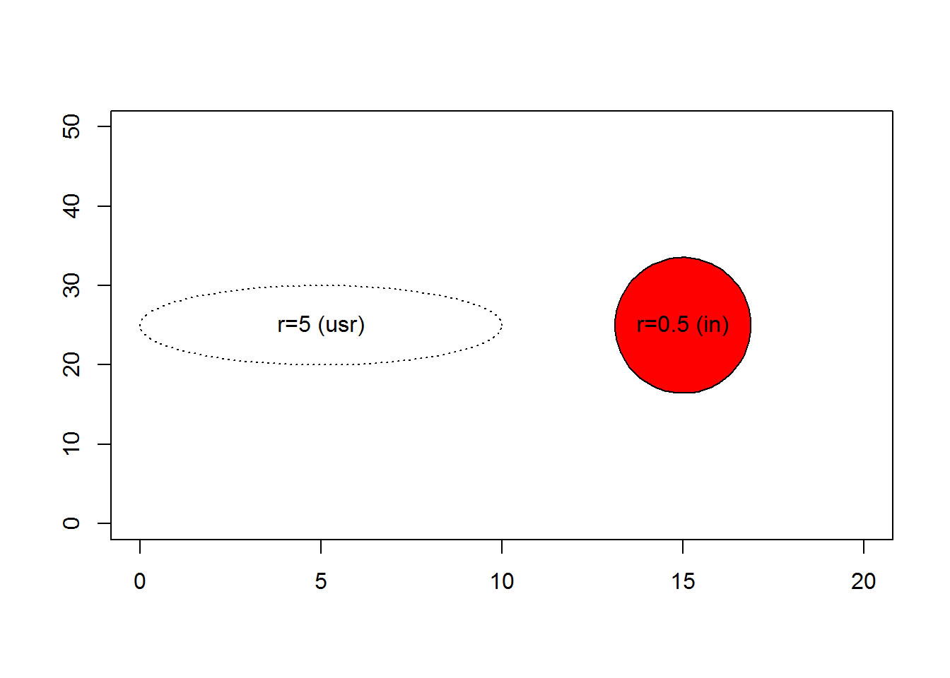
There are three things that are contributing to this problem.
-
The default graph in R Markdown is rectangular. You can measure the size of a graph in inches with the dev.size() function: 7, 5
-
The default margins are uneven with more margins on the top and bottom compared to the left and right sides. You can measure the size of the margins in inches with par(“mai”): 1.02, 0.82, 0.82, 0.42. The size of the bottom margin is listed first, followed by the left, top, and right margins.
-
The number of units on this graph are different for the x-axis and the y-axis. You can measure the minimum and maximum values on the x and y axes using par(“usr”): -0.8, 20.8, -2, 52. Note that, by default, R adds an extra 4% to each end of the axis to reduce problems with clipping.
It’s not necessarily bad to see an ellipse where you were expecting a circle. But if you do want a perfect circle, you need to calculate the size of the plotting region and adjust appropriately.
draw.circle <- function(x0, y0, r, adjust.units=function() {list(x=1, y=1)}, ...) {
  # draw a circle of radius r centered at x0, y0
  # with an adjustment in the horizontal and vertical dimensions
  # The default adjustment is no adjustment
  pi.seq <- seq(0, 2*pi, length=100)
  adj <- adjust.units()
  x.circle <- x0 + adj$x * r * cos(pi.seq)
  y.circle <- y0 + adj$y * r * sin(pi.seq)
  polygon(x.circle, y.circle, ...)
}

convert_to_inches <- function() {
  # This funciton adjusts from user coordinates to inches.
  # There is a short-cut: ratio <- par("cxy") / par("cin")

  # Range of the plotting region in user coordinates
  plot.range.usr <- c(par("usr")[2] - par("usr")[1], par("usr")[4] - par("usr")[3])
  if (verbose) cat("\nThe range of the plotting region is", plot.range.usr, "in user coordinates")

  # Range of the plotting region in inches
  plot.range.in <- par("pin")
  if (verbose) cat("\nThe range of the plotting region is", plot.range.in, "in inches")

  # Number of inches per user coordinate
  ratio <- plot.range.usr / plot.range.in
  if (verbose) cat("\nThere are", ratio, "user coordinates per inch")
  return(list(x=ratio[1], y=ratio[2]))
}

plot(0, 0, xlim=c(0, 20), ylim=c(0, 50), type="n", xlab=" ", ylab=" ")
draw.circle( 5, 25, 5, lty="dotted")
text( 5, 25, "r=5 (usr)")
verbose <- TRUE
draw.circle(15, 25, 0.5, convert_to_inches, col="red")
## The range of the plotting region is 21.6 54 in user coordinates
## The range of the plotting region is 5.759999 3.159999 in inches
## There are 3.75 17.08861 user coordinates per inch
text(15, 25, "r=0.5 (in)")
 {width=“448” height=“320”}
The concept of inches in a graph is a loose one at best. The half inch radius shown above might appears slightly bigger or slightly smaller than a half inch and it will probably change when you move from one computer monitor to another. The size will probably change when you print this graph.
If you’re lucky, the relative size of an inch will mean the same thing in the horizontal and vertical direction, and this will give you a perfect circle, though of an uncertain size. But there is no guarantee even of this. See, for example, R FAQ 5.3 Circles appear as ovals on screen
You may wish to specify the size of your circle in pixels instead. This may or may not be a more stable measure. To do this, you need a measure of pixels per inch.
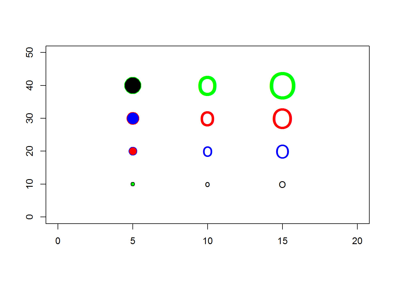
You can also draw a circle using pch=21 or pch=“o” or pch=“O”. The latter two choices are not quite perfect circles, but come pretty close. You can control the size of these circles using the pointsize and/or cex arguments. With pch=21, you can control the fill color with the bg argument.
plot(0, 0, xlim=c(0, 20), ylim=c(0, 50), type="n", xlab=" ", ylab=" ")
co <- c("black", "blue", "red", "green")
points(rep( 5, 4), 10*(1:4), pch=21,  cex=1:4, col=co, bg=rev(co))
points(rep(10, 4), 10*(1:4), pch="o", cex=1:4, col=co)
points(rep(15, 4), 10*(1:4), pch="O", cex=1:4, col=co)
 {width=“448” height=“320”}
Notice the subtle differences in shape and thickness.
If you try this code on your system, your results may not match the results you see here, for a wide variety of reasons that are impossible to list. Graphics are often the result of trial and error, and if you don’t get the results you want right away, keep plugging away.
You can find an earlier version of this page on my blog.