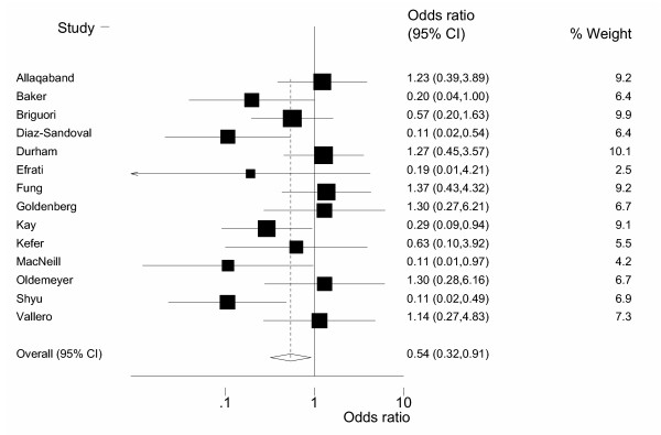
Many meta-analyses use a graph known as a forest plot. I was always confused by the funny squares in a forest plot, so I looked for a description. An example of a forest plot appears in
- Acetylcysteine for prevention of contrast-induced nephropathy after intravascular angiography: a systematic review and meta-analysis. Bagshaw SM, Ghali WA. BMC Med 2004: 2(1); 38. [Medline]](http://www.ncbi.nlm.nih.gov/entrez/query.fcgi?cmd=Retrieve&db=PubMed&list_uids=15500690&dopt=Abstract) [Abstract]](http://www.biomedcentral.com/1741-7015/2/38/abstract) [Full text]](http://www.biomedcentral.com/1741-7015/2/38) [PDF]](http://www.biomedcentral.com/content/pdf/1741-7015-2-38.pdf)
and because this is an open-access article, I can reproduce the graph here.
Here is what the User’s Guide for RevMan (software created by the Cochrane Collaboration) says about forest plots:
The graph is a forest plot where the confidence interval (CI) for each study is represented by a horizontal line and the point estimate is represented by a square. The size of the square corresponds to the weight of the study in the meta-analysis. The confidence interval for totals are represented by a diamond shape. The scale used on the graph depends on the statistical method. Dichotomous data (except for risk differences) are displayed on a logarithmic scale. Continuous data and risk differences are displayed on a linear scale. Generic inverse variance data are displayed on either a logarithmic scale or a linear scale depending on the settings in RevMan. – http://www.cc-ims.net/download/revman/Documentation/User%20guide.pdf (page 36).
You can find an earlier version of this page on my original website.