Overfitting
Overfitting occurs when a statistical model is too complex for the amount of data that it is based on. The summary statistics on the data itself appear to be quite good, but the model will almost always produce poor predictions for new data. Here is an example of overfitting using data on hurricane frequencies from the Data and Story Library site.
The data used in this example (1/2)
##      Decade Count
## 1 1851-1860     6
## 2 1861-1870     1
## 3 1871-1880     7
## 4 1881-1890     5
## 5 1891-1900     8
## 6 1901-1910     4
## 7 1911-1920     7
## 8 1921-1930     5
Here are the first eight rows of data.
The data used in this example (2/2)
##       Decade Count
## 9  1931-1940     8
## 10 1941-1950    10
## 11 1951-1960     9
## 12 1961-1970     6
## 13 1971-1980     4
## 14 1981-1990     4
## 15 1991-2000     5
## 16 2001-2006     7
Here is the rest of the data.
Plot the data
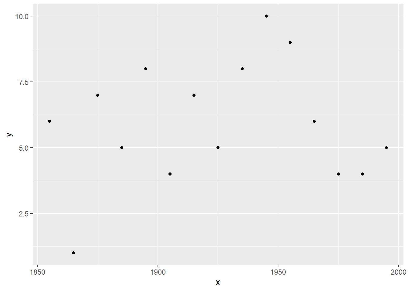
Here’s what the data looks like in a graph. Nothing too unusual about the data. Now let’s try to forecast the number of hurricanes for the next decade.
Plot the data with a linear prediction
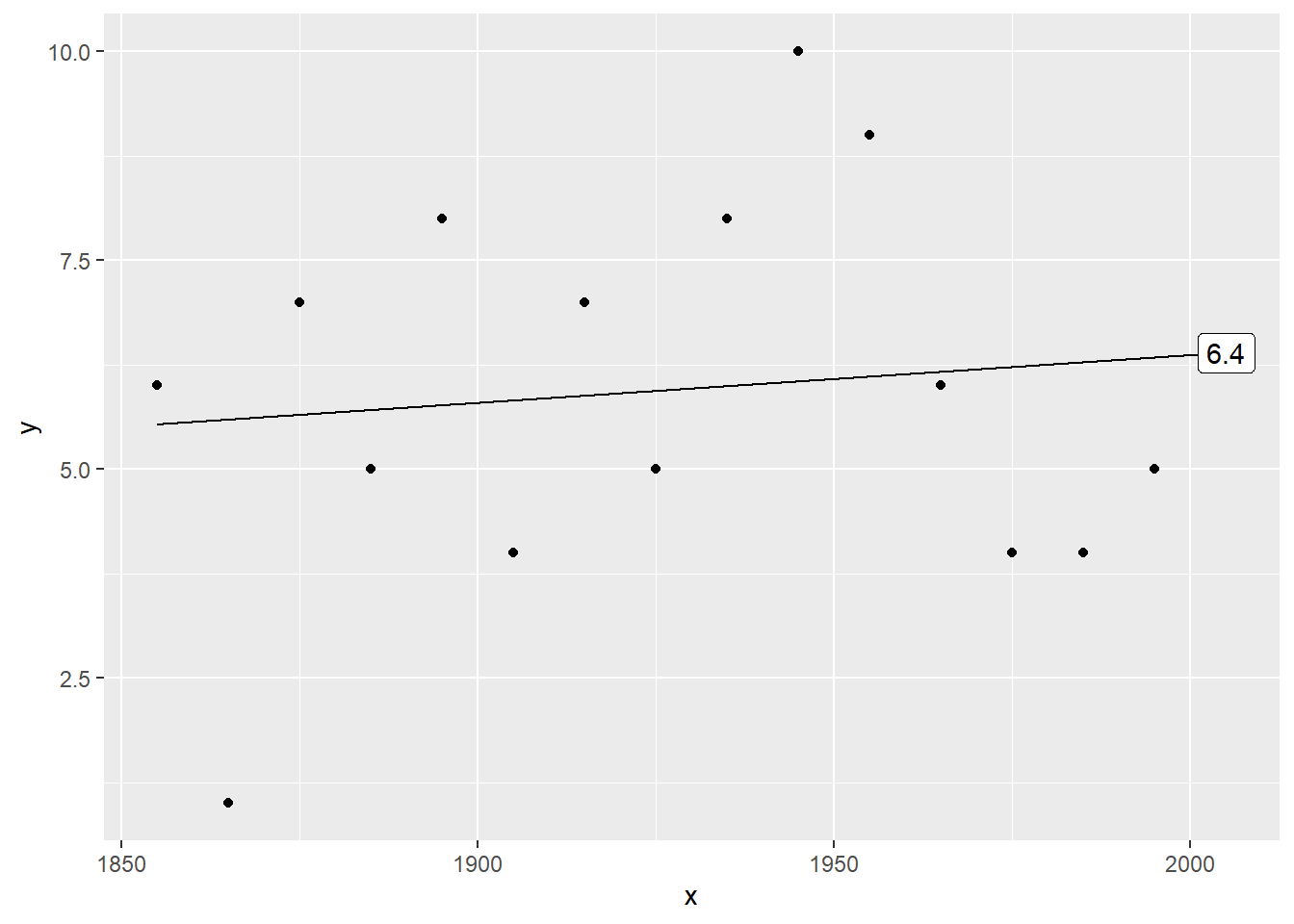
Here’s a linear trend. The prediction is 6.3904762 for the next decade.
Plot the data with a quadratic prediction
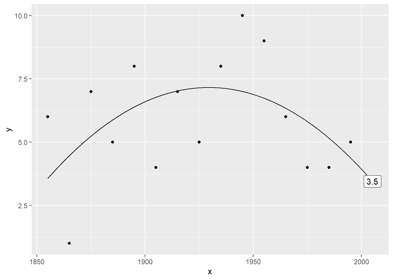
Here’s a quadratic trend. The prediction is 3.4527473. It’s quite a bit different.
Plot the data with a cubic prediction
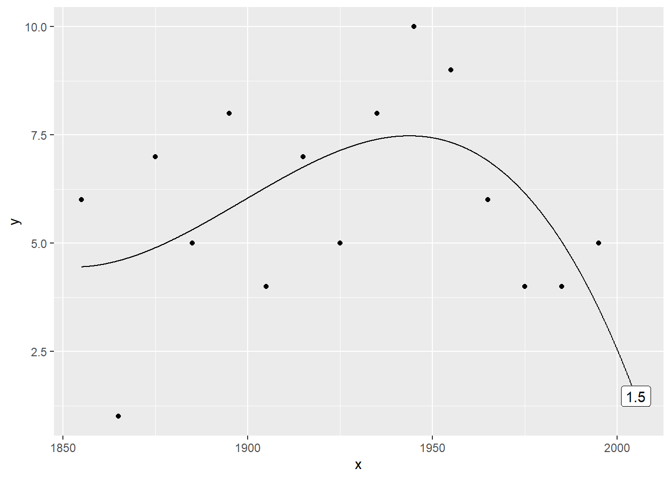
Here’s a cubic (third order polynomial trend. The prediction is now 1.4681319.
Plot the data with a 4th order polynomial
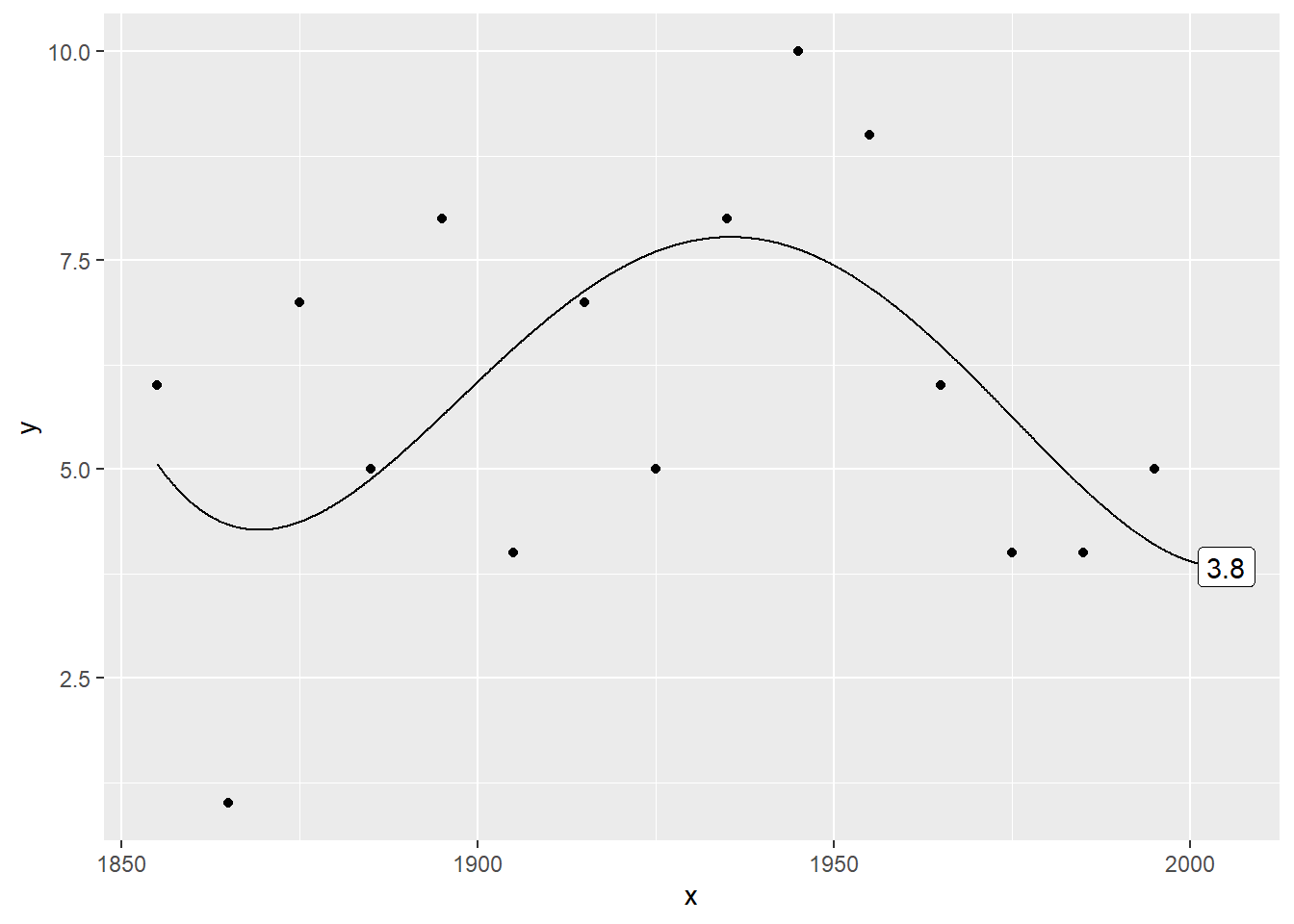
Here’s a quartic (fourth order polynomial) trend. The prediction is 3.8291708.
Plot the data with a 5th order polynomial
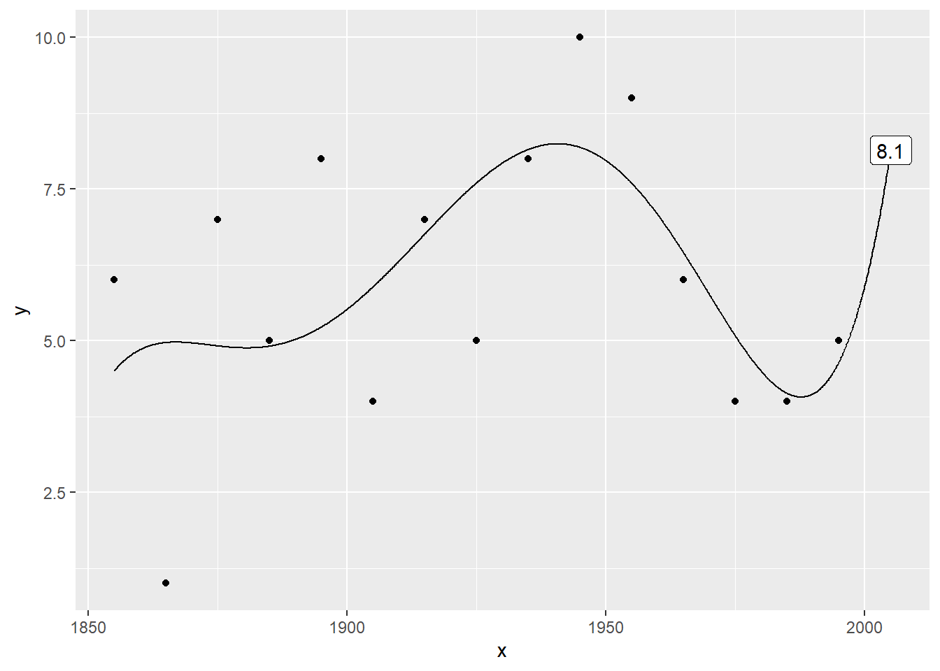
Here’s a fifth order polynomial trend. The prediction is 8.1412587.
Plot the data with a 6th order polynomial
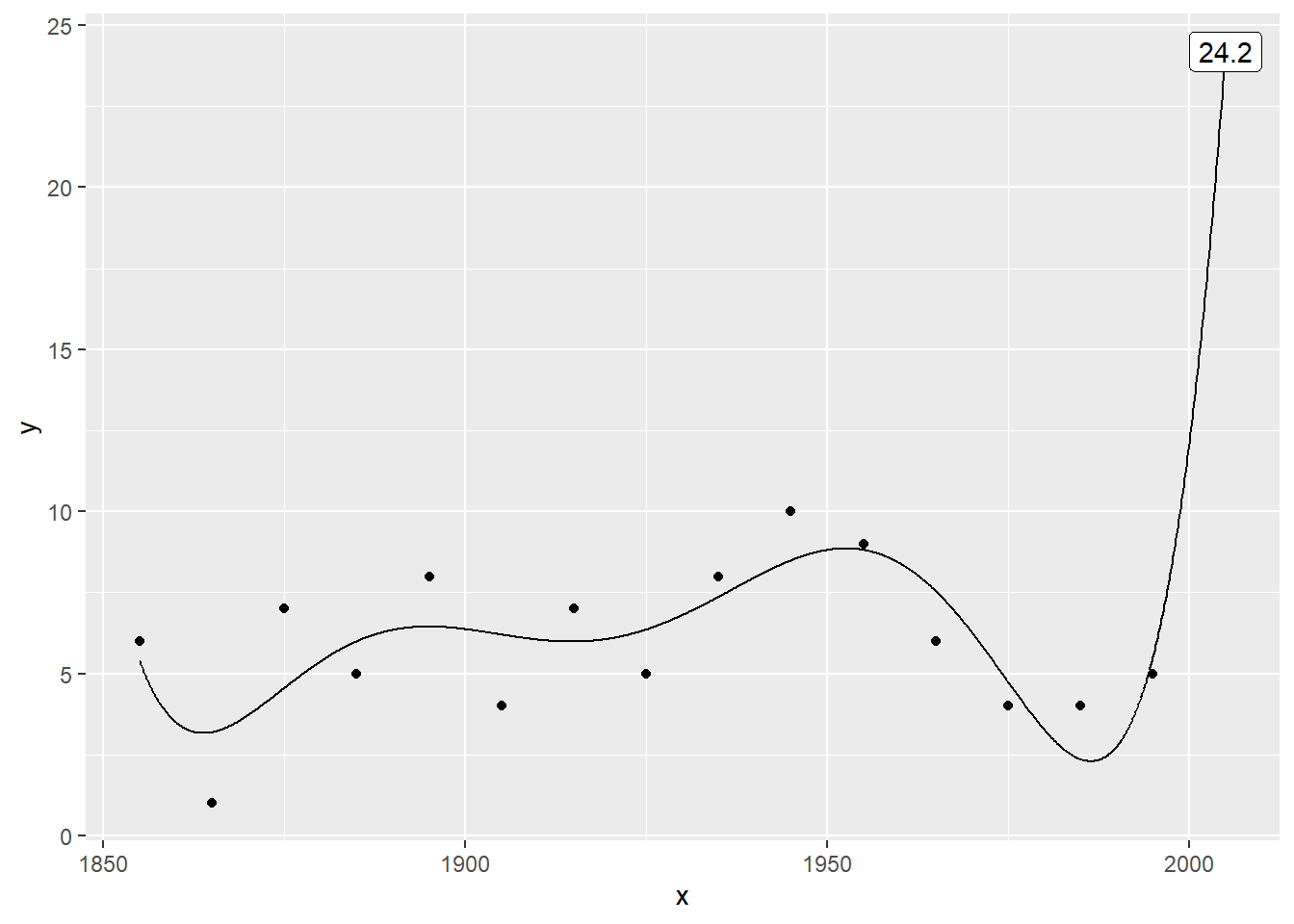
Here’s where things get very weird. The sixth order polynomial produces a prediction of 24.1897436, which is more than twice as large as any previous value.
Plot the data with a 7th order polynomial
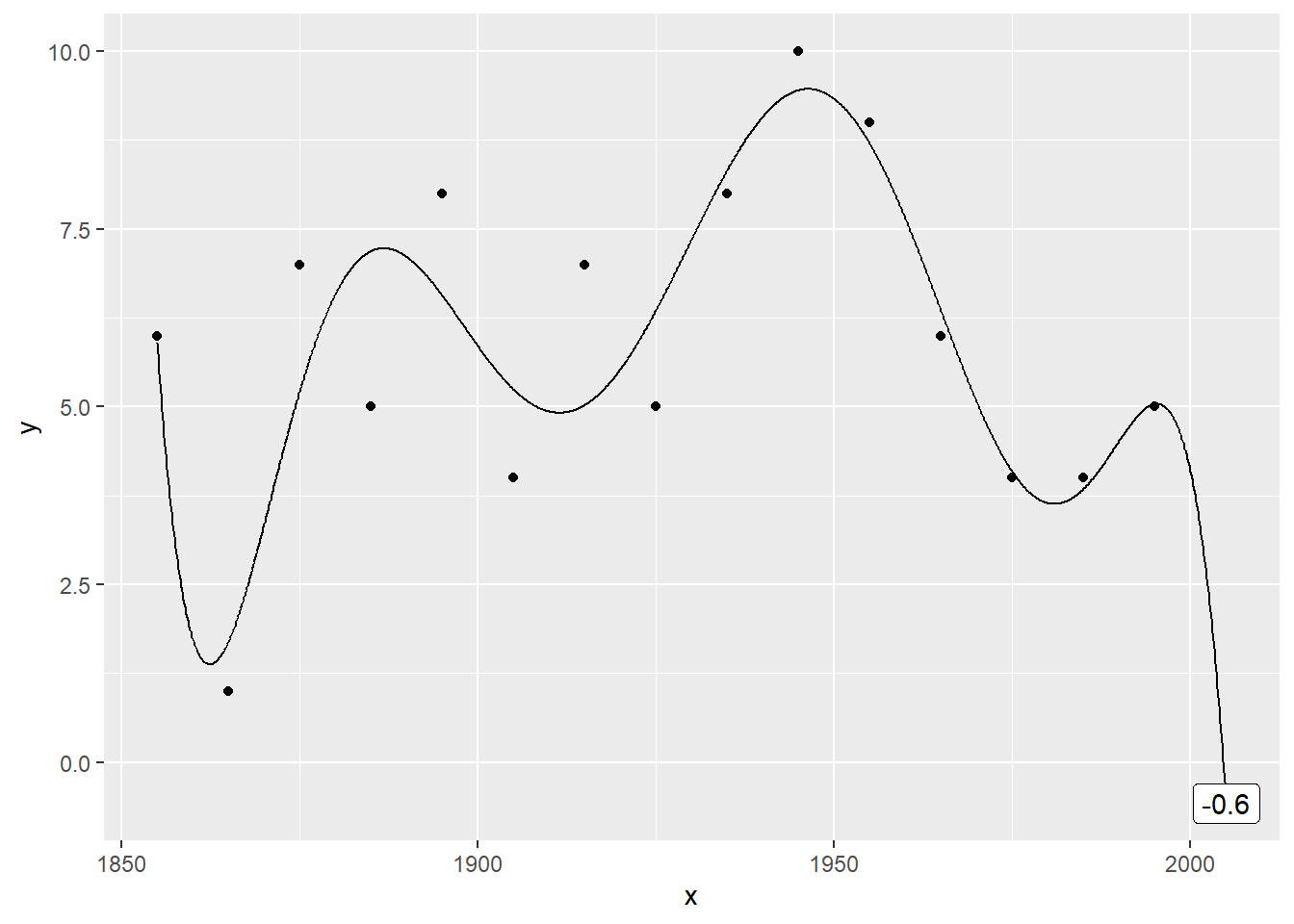
The weirdness continues with the seventh order polynomial trend, which produces a negative prediction (-0.5794872.
Plot the data with a 8th order polynomial
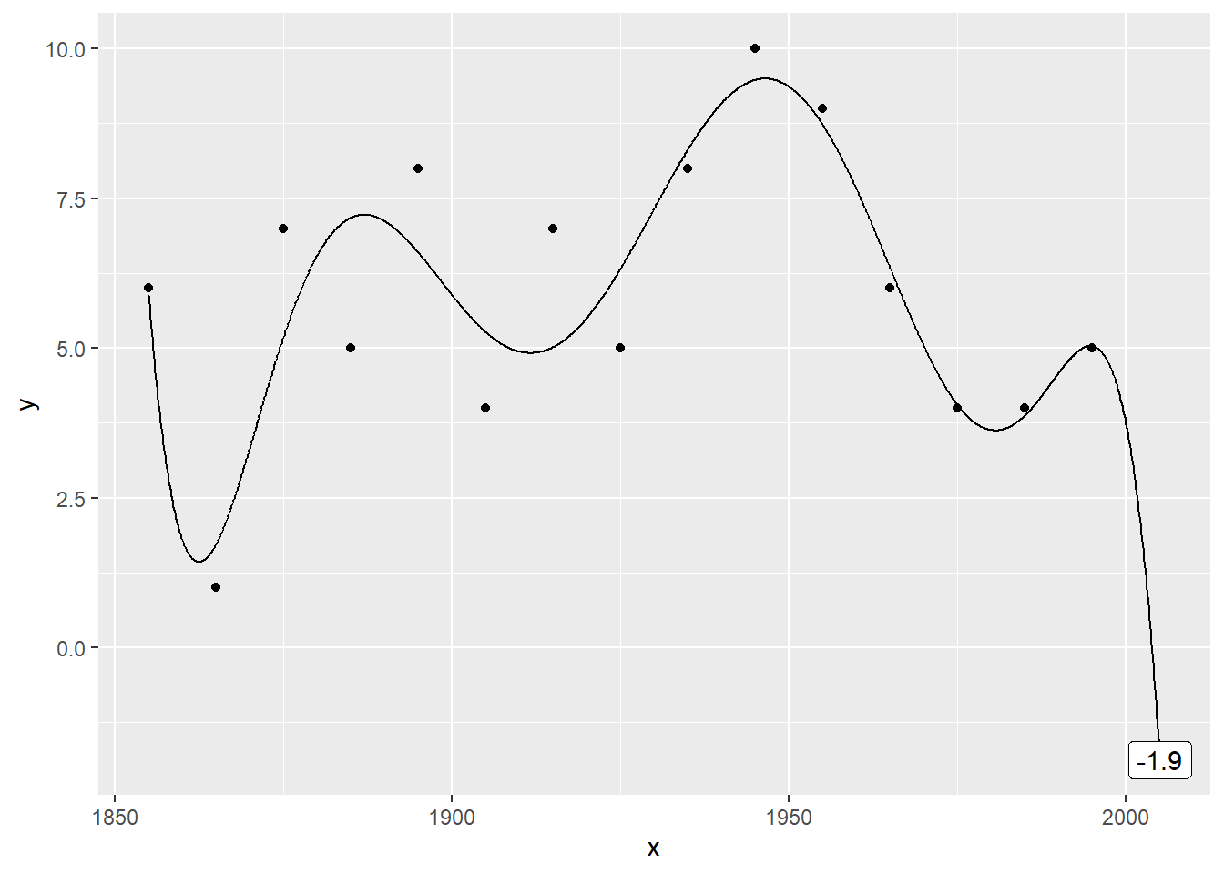
The eigth order polynomial trend also produces a negative prediction (-1.8747253).
Plot the data with a 9th order polynomial
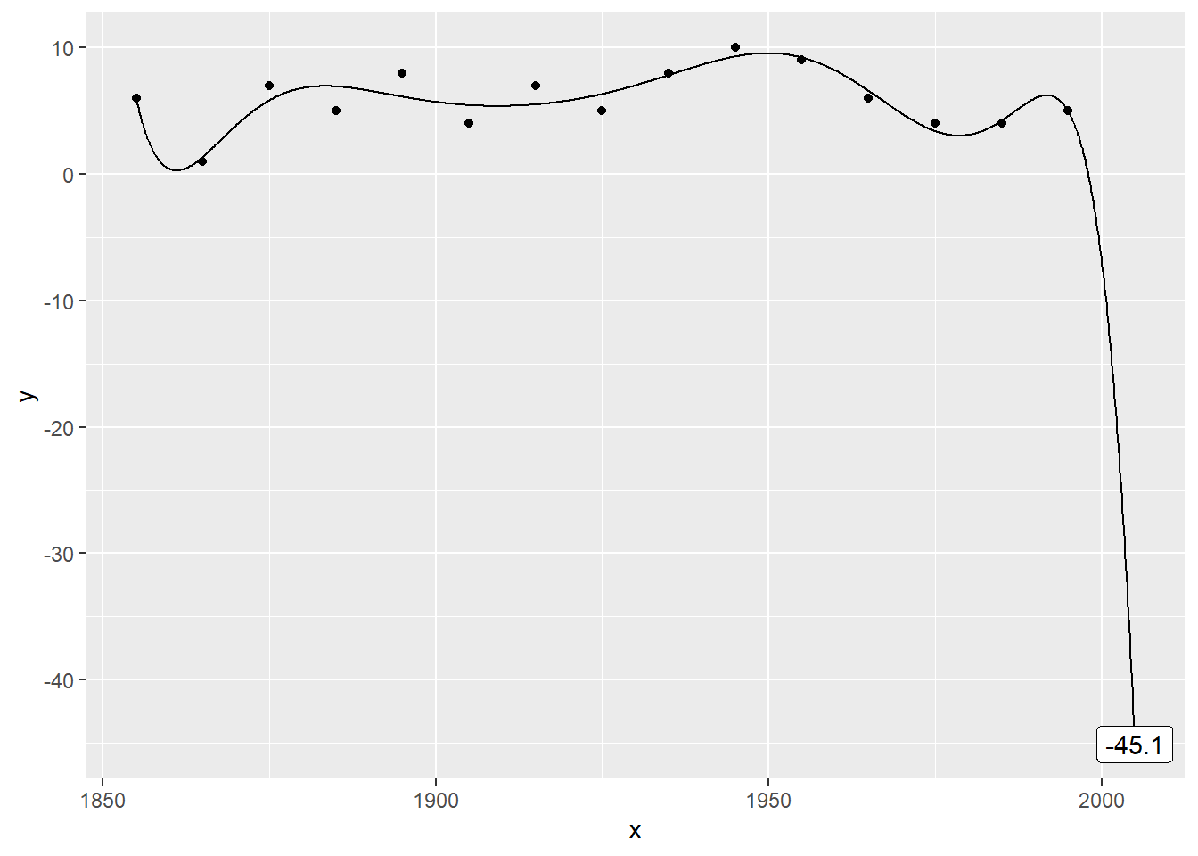
Here’s a ninth order polynomial trend. The prediction is so extreme (-45.0805861) as to be ridiculous.
Plot the data with a 10th order polynomial
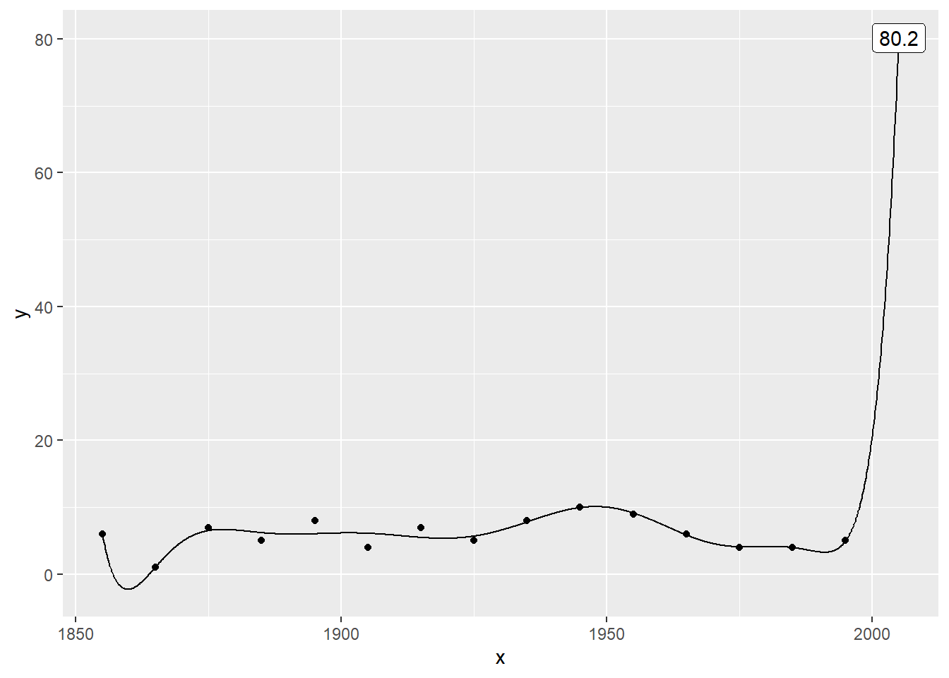
For the record, here are the tenth…
Plot the data with a 11th order polynomial
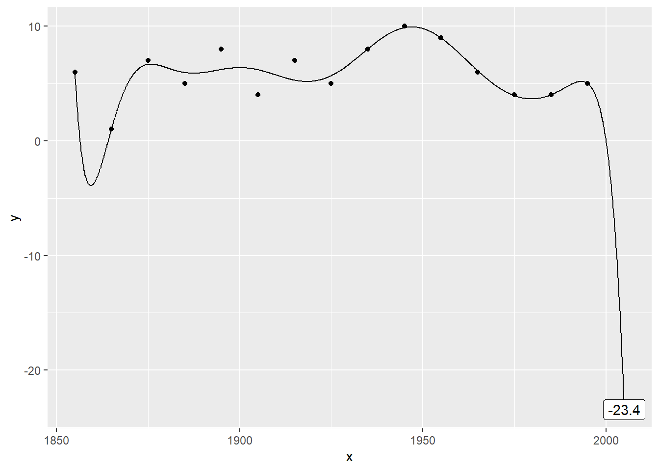
… eleventh …
Plot the data with a 12th order polynomial
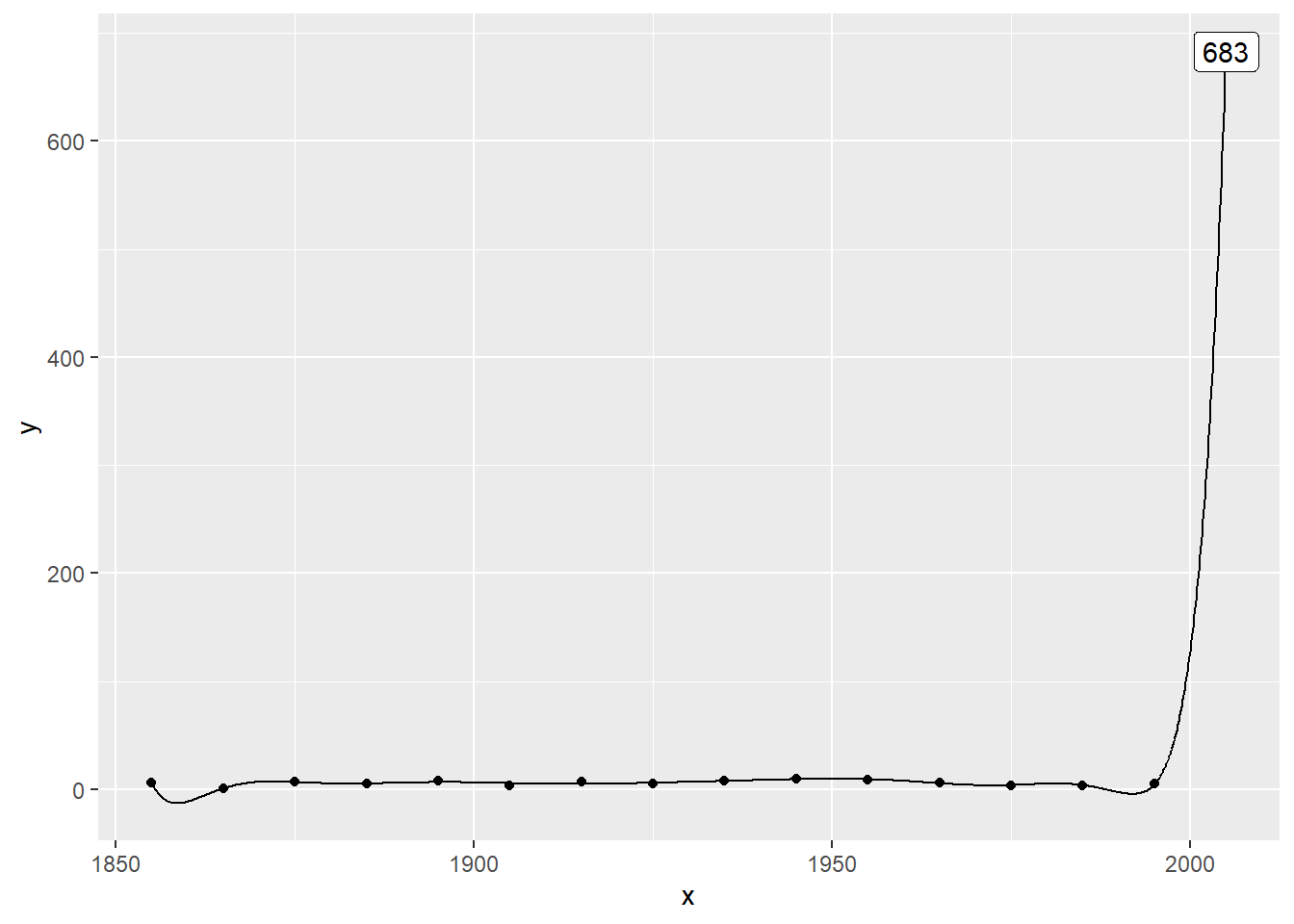
… twelfth …
Plot the data with a 13th order polynomial
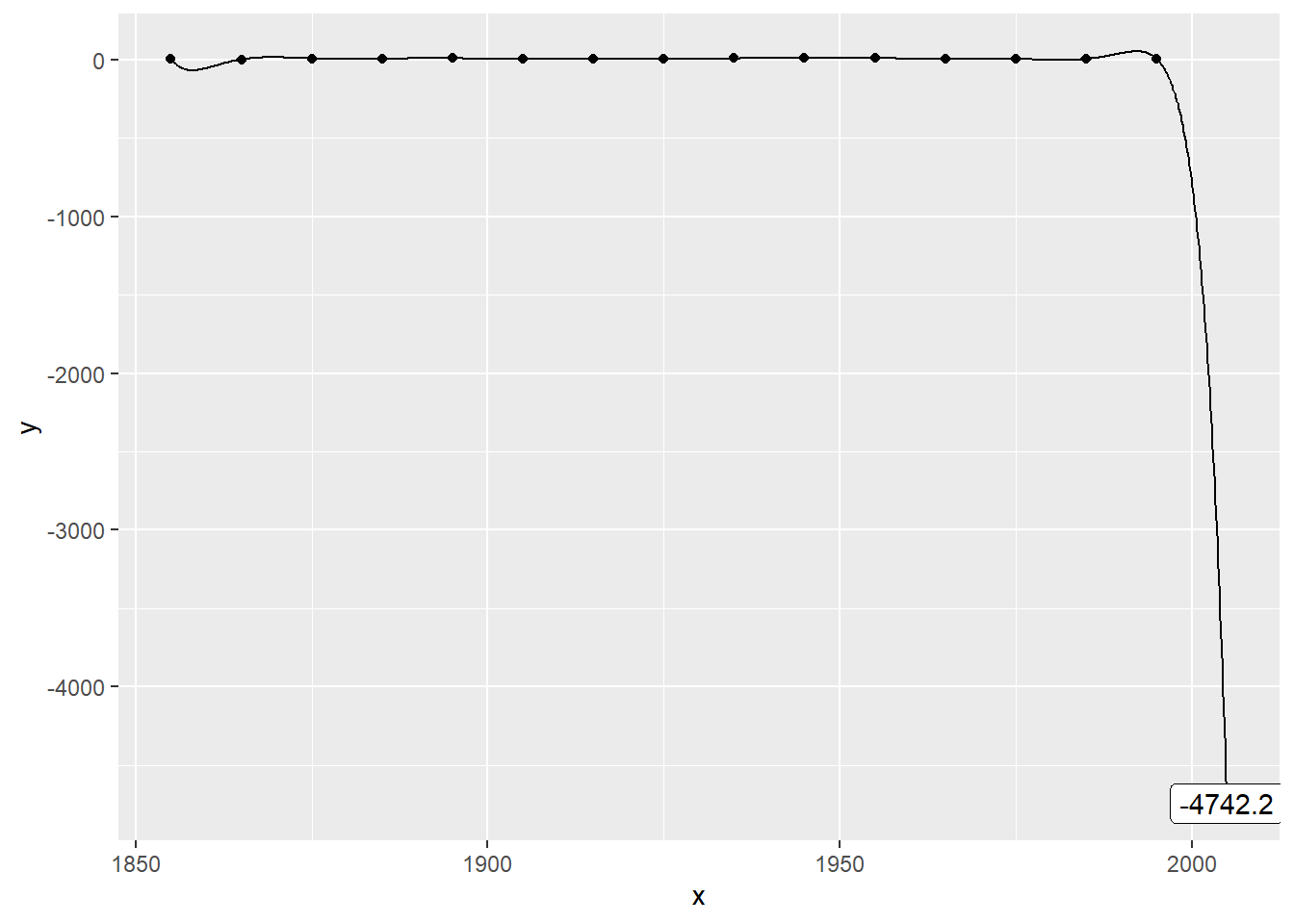
… thirteenth …
Plot the data with a 14th order polynomial
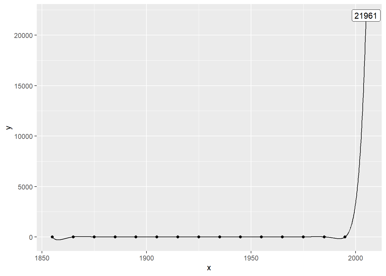
… and fourteenth order polynomials.
Code (load libraries)
suppressMessages(suppressWarnings(library(broom)))
suppressMessages(suppressWarnings(library(dplyr)))
suppressMessages(suppressWarnings(library(ggplot2)))
suppressMessages(suppressWarnings(library(knitr)))
suppressMessages(suppressWarnings(library(magrittr)))
knitr::opts_chunk$set(echo=FALSE)
Here are the libraries that I needed for this work.
Code (read and print)
fn <- "https://dasl.datadescription.com/download/data/3279"
raw_data <- read.delim(file=fn, header=TRUE, sep="\t")
raw_data[1:8, ]
raw_data[9:16, ]This code reads data directly from the website and prints out the data in two pieces.
Code (plot data points)
df <- data.frame(x=seq(1855, 1995, by=10), y=raw_data$Count[1:15])
ggplot(df, aes(x, y)) +
  geom_point() -> point_plot
plot(point_plot)
Here’s the code for plotting the data points. I save the graph in an object so I can add trend lines later on.
Code that I used
add_trend <- function(point_plot, df, degree) {
  x_grid <- data.frame(x=seq(1855, 2005, by=0.1))
  lm(y~poly(x, degree), data=df) %>%
    augment(newdata=x_grid) -> yhat
  yhat_2005 <- filter(yhat, x==2005)
  prediction <<- yhat_2005$.fitted
  point_plot +
    geom_line(data=yhat, aes(x, .fitted)) +
    geom_label(
      data=yhat_2005,
      aes(x, .fitted, label=round(.fitted, 1)))
}
add_trend(point_plot, df, 1)
Here’s the code for adding a trend line to the graph. I am setting up a flexible function that can print the trend from any polynomial.
Code that I used
add_trend(point_plot, df, 2)add_trend(point_plot, df, 3)add_trend(point_plot, df, 4)add_trend(point_plot, df, 5)add_trend(point_plot, df, 6)add_trend(point_plot, df, 7)add_trend(point_plot, df, 8)add_trend(point_plot, df, 9)add_trend(point_plot, df, 10)add_trend(point_plot, df, 11)add_trend(point_plot, df, 12)add_trend(point_plot, df, 13)add_trend(point_plot, df, 14)It took a bit of work to put everything in a function, but now you can produce a quadratic or higher level trend rather than a linear trend with just a single line of code.