If you are collecting data on proportions with a consistent denominator for each proportion, then you can plot this data on a control chart. This type of chart is called a P chart and it is very simple to calculate. Here is an example of some data that is appropriate for a P chart. An employee was asked to take a hearing test on 24 consecutive weeks. The hearing test consisted of listening to and trying to recognize 50 spoken words that were recorded with some background noise. The score is the percentage of words recognized correctly. This data set is loosely adapted from a larger data set at the DASL website [link is broken].
Here is the data:
28 24 32 30 34 30 36 32 48 32 32 38
32 40 28 48 34 28 40 18 20 26 36 40`
The formula for the upper and lower control limits is
where pbar is the average of the individual proportions and n is the denominator for each individual proportion. If you want to compute upper and lower warning limits, the formula for these is
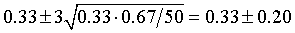
The average proportion is 0.3275 and n is 50. The control limits are computed as
Here is what the control chart looks like:
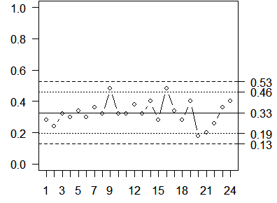
Notice that all data points are inside the upper and lower control limits and that we do not observe 2 out of 3 consecutive points outside the warning limits. Neither do we see eight consecutive points on the same side of the center line. Thus, this process is in statistical control. This individual’s hearing may not be all that good, but there are no unusual deviations from what you would normally expect.
On your own. Two other workers also took the same series of hearing tests (see data below). Compute a P chart for each worker. Don’t peek until you’ve done the work, but the answers are available on a separate web page.
Worker #2:
60 56 78 60 74 70 70 68 82 76 72 76
68 78 76 68 74 56 74 62 60 70 60 84

Worker #3:
34 42 30 24 42 32 30 36 36 48 40 26
46 42 48 24 36 24 48 30 24 28 32 44`
You can find an earlier version of this page on my old website.