Dear Professor Mean, My colleagues and I argue over the most appropriate way for displaying tables of percentages. Must the row or column always add to 100%? Also in cases where it is difficult to know which variable is dependent how does one decide the best way to present the results? – Garrulous Gail
Dear Garrulous,
When you are deciding how to display two by two (or larger) tables, you have a variety of ways to do this. No way is correct all the time, and some of choices reflect subjective judgment. But here are some rules I use.
1. Never display more than one type of number in a table.
Statistical software like SPSS can produce counts
- row percents, column percents
- cell percents
- expected counts
- residuals
- and/or cell contribution to chi-squared values. At one time or another you might want to use each of these statistics
- but never all at one time. Two or more numbers in a table causes confusion and makes your tables harder to interpret.
Present a single summary statistic in the table if at all possible. If you need to display two summary statistics (for example
- both counts and row percentages)
- then place the counts in one table and the row percentages in a different table. If you have to fit them in the same table
- place the two numbers side by side with the less important number appearing second and in parentheses For example
- 54% (257).
2. Row percentages are usually best.
Row percentages are the percentages you compute by dividing each count by the row total. Row percentages place the comparison between two numbers within a single column
- so that one number is directly beneath the number you want to compare it to. This is usually better than column percents
- where the numbers you want to compare are side by side. If you find that column percentages make more sense. Consider swapping the rows and columns.
If you find that cell percentages make the most sense
- consider creating composite categories that combine the row and column categories. Cell percentages are the percentages that you get when you divide each cell count by the overall total. When cell percents are interesting
- it usually means that you are interested in the four distinct categories in your two by two table. For example
- you are interested in seeing what fraction of job candidates are white males, rather than seeing how the probability of being male influences the probability of being white. For this type of data
- treat it as a single categorical variable with four levels (white males
- white females
- black males
- black females) rather than two categorical variables with each having two levels (black/white
- male/female).
3. Place the treatment/exposure variable as rows and outcome variable as columns.
This relates to the above item. You usually are interested in the probability of an outcome like death or disease
- and you are interested in how this probability changes when the treatment or exposure changes. Arranging the table thusly and using row percents usually gets you the comparison you are interested in.
4. If one variable has a lot more levels than the other variable, place that variable in row.s
A table that is tall and thin is usually easier to read than a table that is short and wide. It is easier to scroll up and down rather than left and right. For a really large number of levels
- you might have to print your table on two or more pages. Usually it is a lot easier to align these pages if the table is tall and thin. A short wide table that is split on two or more pages is often a disaster.
**5. Whenever you report percentages
- always round.**
A change on the order of tenths of a percent are almost never interesting or important. Displaying that tenth of a percent makes it harder to manipulate the numbers to see the big picture.
6. Don’t worry about whether your percentages add up to 99% or 101%.
First of all
- it can’t happen with a two by two table unless you round incorrectly. For a larger table
- it can happen
- but your audience is sophisticated enough to understand why this is the case. No one
- for example
- is going to be upset when 33% plus 33% plus 33% adds up to less than 100%.
**7. When in doubt
- write out your table several different ways.**
Pick out the one that gives the clearest picture of what is really happening. Don’t rely on the first draft of your table
- just like you would never rely on the first draft of your writing.
Examples
A simple fictitious example will help illustrate these points.
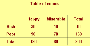
We classify people by their income (rich/poor) and also by their attitude (happy/miserable). There are
- for example
- 30 rich happy people in our sample and 70 poor miserable people.
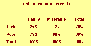
This figure shows column percentages. We compute this by dividing each number by the column total.
We see for example that only 25% of all happy people are rich. This is a conditional probability and is usually written as P[Rich | Happy]. Read the vertical bar as “given.” So this probability is read as the probability of being rich given that you are happy.
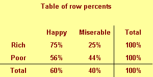
This figure shows row percentages. We compute this by dividing each number by the row total.
We see
- for example that 75% of rich people are happy. This is a different conditional probability
- P[Happy | Rich]. Read this as the probability of being happy given that you are rich.
Notice the distinction between the two probabilities. Only a few happy people are rich
- but most rich people are happy.
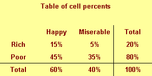
This figure shows cell percentages. We compute this by dividing each number by the grand total. Each percentage represents the probability of having two conditions. For example
- there is a 15% chance of being rich and happy.
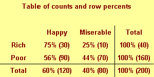
The table above shows a good format for combining two numbers in a single table.
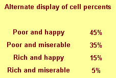
This is an alternate way of displaying cell percentages.
If we had a six categories for attitude rather than just two
- we might arrange the table differently.
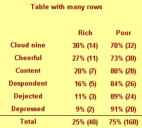
Notice that this table would not require any sideways scrolling.
Summary
- Never display more than one type of number in a table.
- Row percentages are usually best.
- Place the treatment/exposure variable as rows and outcome variable as columns.
- If one variable has a lot more levels than the other variable
- place that variable in rows.
- **Whenever you report percentages
- always round.**
- Don’t worry about whether your percentages add up to 99% or 101%.
- **When in doubt
- write out your table several different ways.**
You can find an earlier version of this page on my original website.