One of the doctors I was working with had an interesting data set examining adverse events in patients with peritoneal dialysis. These patients start treatment with peritoneal dialysis on a specific day and are followed until they stop this treatment. Reasons for stopping peritoneal dialysis might be that the patient got better and no longer needed any treatment, the patient got worse and needed to switch to hemodialysis, or the patient died. Patients who moved out of town presumably continued their dialysis, but they were lost to follow-up in this particular study. There were two adverse events examined: exit site infections, and peritonitis. Although I ran several complex analyses on this data set, I thought it might be useful to look at a simpler approach to monitoring the frequency of adverse events using control charts.
Here’s the data on when patients began treatment and when they ended their treatment.
id t0 t1
0 58 680
1 95 1416
2 189 1247
3 207 532
4 402 1136
5 412 501
6 431 1851
7 550 1414
8 581 1339
9 770 2325
10 809 1498
11 841 1339
12 880 1563
13 903 2664
14 939 1451
15 980 2920
16 1106 2103
17 1107 1291
18 1155 1792
19 1159 1654
20 1200 1968
21 1247 1574
22 1422 2247
23 1449 1544
24 1499 2310
25 1582 1755
26 1677 2142
27 1786 2920
28 1799 2108
29 1803 2729
30 2097 2723
31 2101 2639
32 2225 2419
33 2254 2920
34 2496 2920
35 2500 2920
36 2507 2920
37 2562 2730
38 2590 2870
39 2663 2920
40 2701 2838
41 2711 2920
The first column is the patient id, the second column is when the patient started dialysis (number of days since the start of the review period), and the third column is when the patient ended dialysis (again in number of days).
There were 42 patients in this study. The average patient stayed in the study for 640 days (1.8 years). We will divide the number of days by 365 in most graphical presentations of the data to show time in years rather than days.
This graph shows the cumulative number of patients at risk of an adverse event at any time point in the review period.
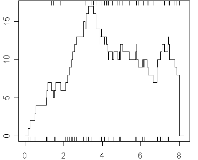
The vertical line segments at the bottom of the graph represent the times that patients began dialysis and the segments at the top of the graph represent the times that patients ended dialysis. Each time a patent begins dialysis, the graph jumps up one unit. Every time a patient ends dialysis, the graph drops one unit. At the busiest time, there were 17 patients on dialysis. The graph falls to zero at 8 years, not because all patients were removed from dialysis, but because that represented the end of the observation period.
Notice that this graph generally climbs for the first three years, drops of a bit then is roughly level for years 4 through 8. This is not surprising because only patients who began dialysis during the eight year observation window were included in the study.
Here are the times of exit site infections:
id tx
0 643
0 657
1 143
1 203
1 756
1 900
1 1122
1 1331
2 596
3 231
4 905
4 953
4 986
6 680
6 1273
6 1410
6 1485
6 1584
7 967
9 1292
12 1442
13 1331
13 1351
13 2528
13 2658
14 949
14 1261
14 1447
16 1250
21 1267
27 1947
33 2520
33 2767
35 2769`
Notice that some patients experience more than one exit site infection and some patients experience no infections. You might already notice something interesting with the data. About half of the events have three digit days (days in the hundreds). Since the full time range is from zero to a bit less than 3 thousand, you would expect only about a third of these events to have three digit days. This is possible evidence that these events occurred more frequently early in the review period rather than later. A careful analysis, of course, would have to control for the number of patients at risk during these time intervals.
Here is the data on times of peritonitis.
id tx
0 218
1 652
1 1265
1 1328
3 237
7 641
7 1004
7 1080
9 978
9 1036
9 1236
9 1974
9 2116
10 904
10 1305
13 1815
13 1983
13 2082
14 949
15 2859
20 1959
24 1977
24 2089
25 1620
25 1641
27 1803
27 2354
27 2520
28 1809
28 2054
33 2351
41 2740
41 2755`
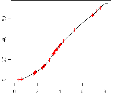
The graph below shows the cumulative number of patient years over the eight year study (you can get this by integrating the figure shown above). This graph also notes the occurrence of exit site infections using a red plus sign.
Here’s a second graph with occurrence of peritonitis marked with a red plus sign.
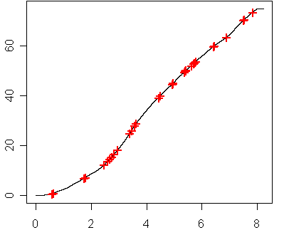
The horizontal distance between successive plus signs represents the waiting time in years between the successive patients. The vertical distance between successive plus signs represents the waiting time in patient-years. It’s a subtle but important difference. By calculating the number of patient-years between successive events, you can It adjusts for the fact that during the first two or three years of observation, there were fewer patient-years of data compared to successive years.
If you plot the patient-years between successive exit site infections, you will see the following control chart.
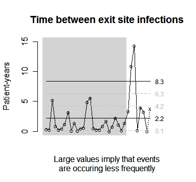
The gray region represents the first four years of the study. After the fourth year, an intervention was implemented to reduce adverse events. You can see that it had a dramatic impact at first, with the hospital twice waiting over 10 patient year between events shortly after the intervention started. More recently, it looks as if the waiting time has slipped back at least partway to the norm.
Here’s the plot for peritonitis events.
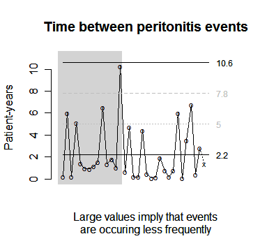
Notice that there is no evidence that peritonitis is becoming a rarer event after the intervention.
You can find an earlier version of this page on my old website.