I ran across a graph in a journal article. The article itself was good, but the graph had a rookie mistake. I shouldn’t point this out, because I myself have been guilty of far worse mistakes. But this graph illustrated the point far better than anything I could have said.
The display is a series of stacked bar charts, and it showed that certain types of information were most likely to be entered by a physician. It was least likely to be entered by a case manager.

Find the full article found here.
Notice that the colors used to distinguish physician from social worker from nurse from case manager represented a gradient of oranges from a dark almost brown orange to a very light orange.
Gradients are very useful for showing changes in a continuous variable, and possibly in an ordinal variable as well. But the list of providers is nominal. There is no natural ordering from physician to social worker to nurse to case manager. For nominal data, you want to choose a set of colors that are readily distinguishable from one another. The usually means evenly spaced points along a color wheel.
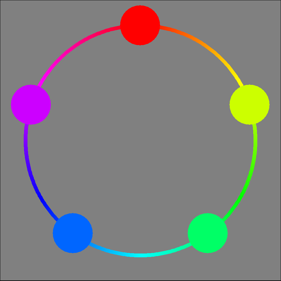
Here’s an example of what I mean.

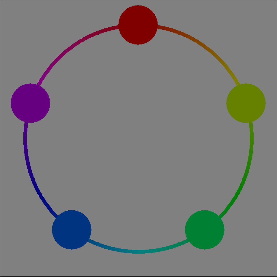
This color wheel includes the pure colors (pure yellow, pure green, pure cyan, pure red, pure magenta, pure blue) and these colors are sometimes a bit harsh on your eyes. A darker set of colors is a bit easier to view.

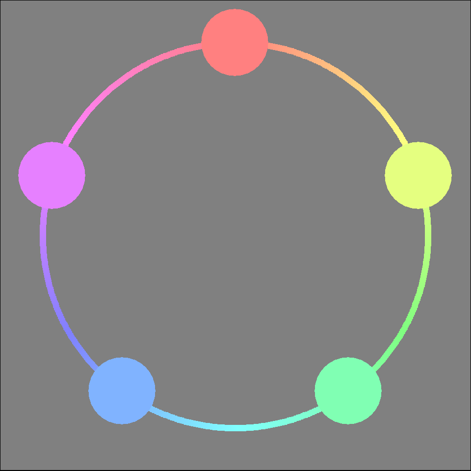
You might also consider lighter colors. These are pastel colors. Going lighter or going darker will depend on many factors, but either choice is usually better than using the pure colors.

There are lots of choices in various graphics packages. Here is one nice set of categorical color choices in R.

These aren’t taken directly from a color wheel but they are well spaced out from a visual perspective, meaning that it is easy to distinguish between any two pairs of these different colors. You can find similar choices in Python, SAS and Stata.
SPSS does not have specific color palettes for nominal data, but it does organize its colors so that most of the rows are good choices for representing nominal data and most of the columns are good choices for representing ordinal data.

Ordinal data is often well represented by a gradient of dark to light levels of a particular color, but this is a poor choice for nominal data. With nominal data, you want a good amount of separation between any two colors. You can get this by selecting evenly spaced values on a color wheel.